Richmond Bell Architects: Rebrand and Web Design
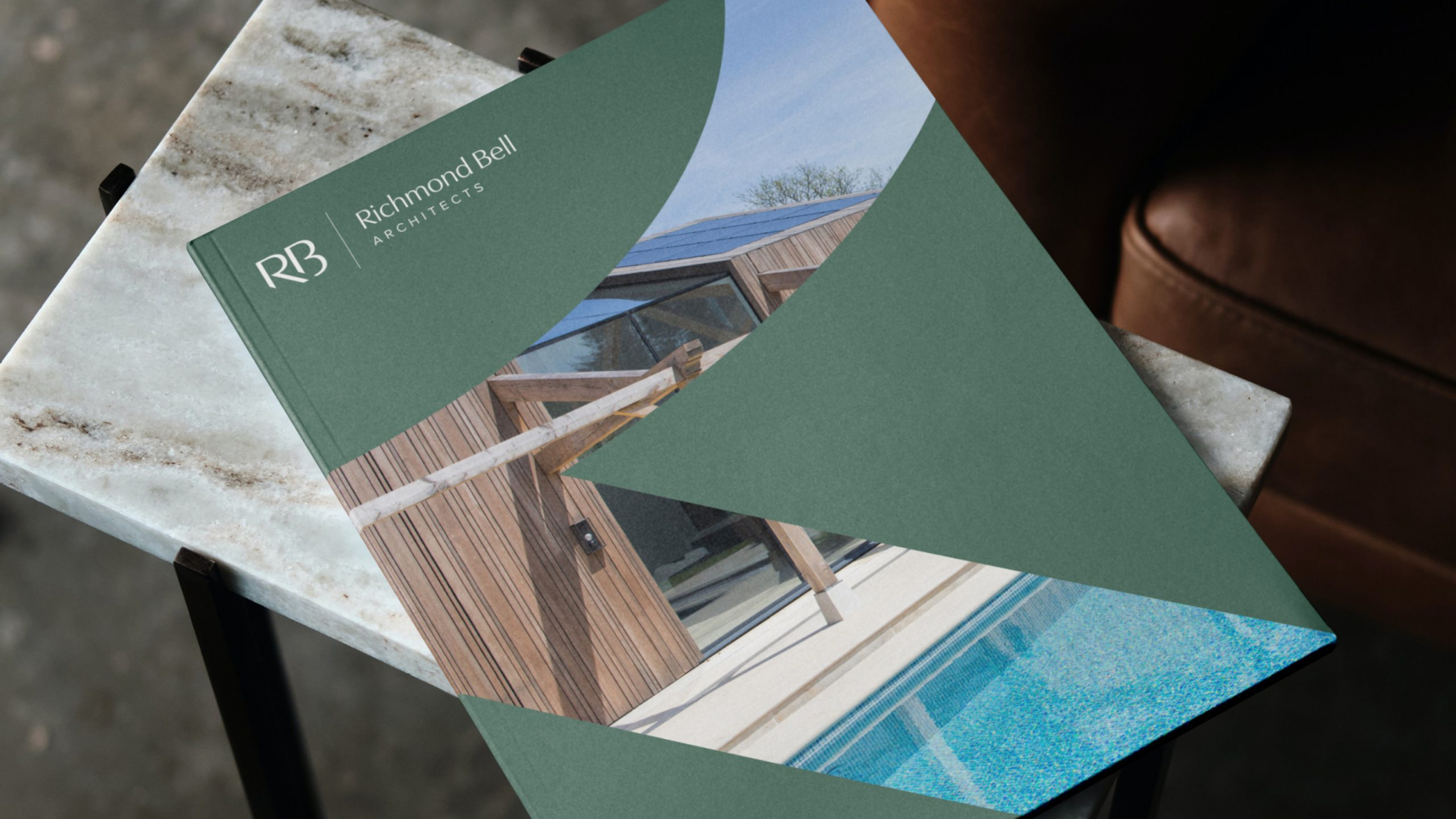
Award-winning sustainable architects
Richmond Bell Architects in Salisbury came to us for a rework of their brand identity and a complete redesign and build of their website. Dream project!
Services
- Brand & Identity
- Development
- Web Design
Industries
- Architecture
Visual Identity
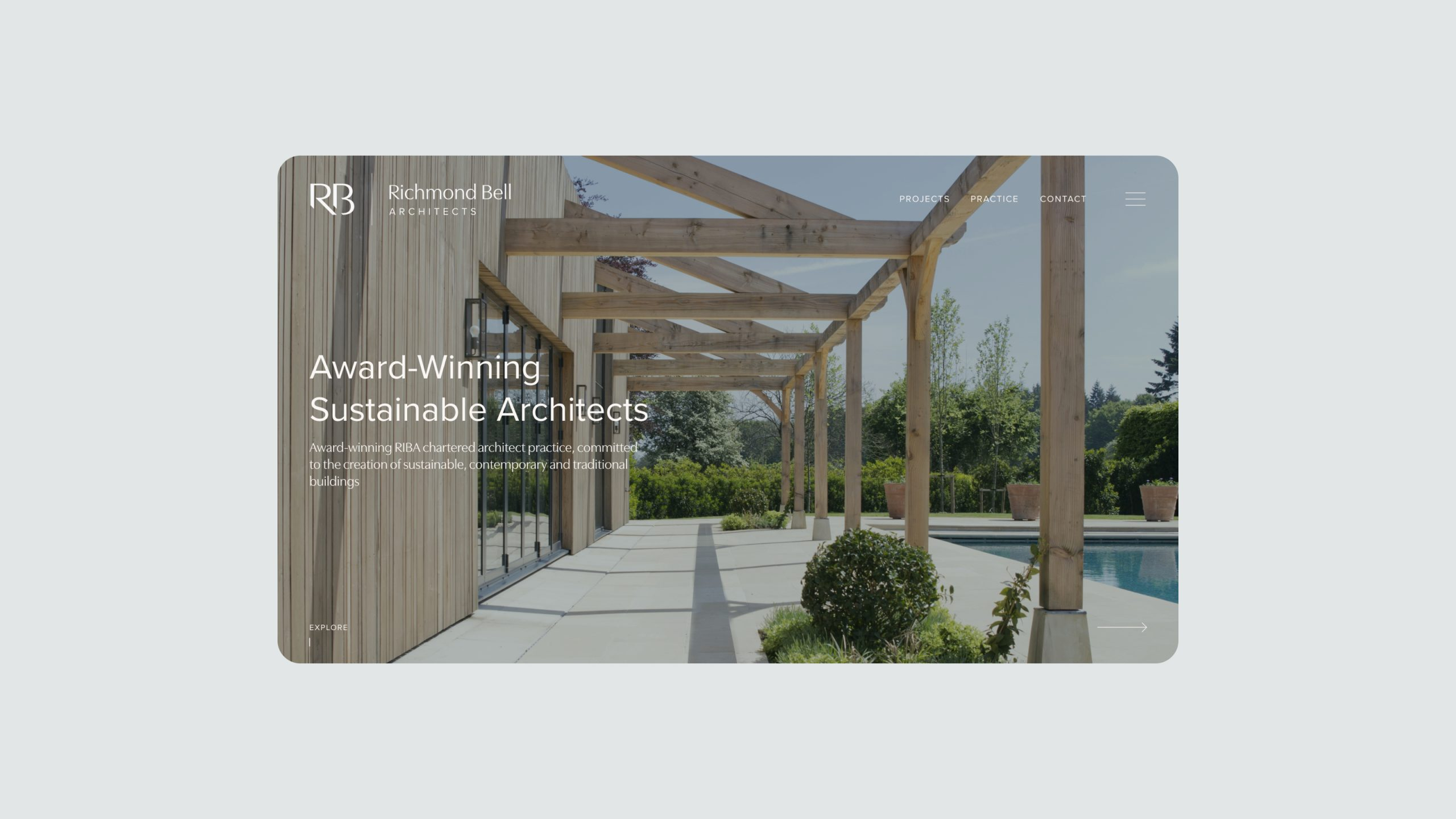
Giant Peach was brought on board to design a contemporary and engaging visual identity that demonstrates RBA’s professionalism and niche expertise, together with aligning the brand with the newer, sustainable and ecological direction of the business.
Other key focus points for inclusion during this part of the project were exploring custom typographic treatments within predominately letterform based brandmarks, solidifying consistency across the identity and lock up combinations and brandmark/full identity isolation.
In terms of broadening the colour palette, we took cues from more sustainability-influenced palettes and tones.

Brand Process
We provided RBA with a selection of creative routes, presenting mood boards which each covered a different focus area.
From these routes we developed our first three concepts, exploring minimalist design and grotesque typography, playing with letterforms to create shape along with fine keylines, horizontal/vertical letter balance and positioning.
We also explored softer approaches for a stronger sustainable feel, looking at delicate and more intricate serif typefaces. We also developed monogram based brandmarks and paired natural negative space with stronger, blockier typeface choices.
RB Linework
For the final stage of development, we removed the ‘A’ from the brandmark, as ‘Architects’ was to sit as a secondary line underneath the wordmark.
We then refined the ‘RB’ by extending the leg of the ‘R’, shearing off descender terminals of the ‘R’ and ‘B’ and tightening the kerning between the two letters.
We ensured that all sheared angles and typeface weights matched accurately because when you’re an architect, attention to even the smallest detail is key. We created a grid with which we fine-tuned the brandmark to the millimetre.

Brand Summary
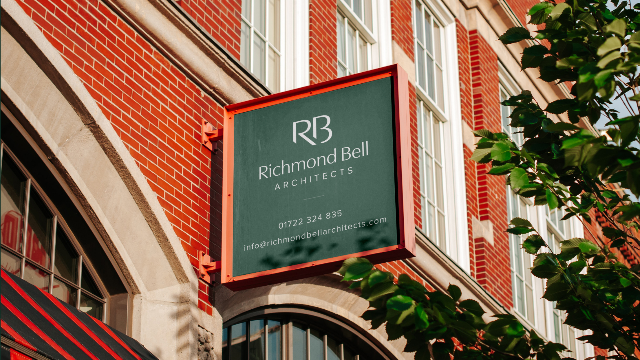
The final identity incorporates a keyline spaciously positioned between the brandmark and the wordmark, with the extension of the typeface chosen for the brandmark used for ‘Richmond Bell’, and a secondary, sans-serif typeface used for ‘Architects’ set in uppercase.
RBA’s refreshed contemporary identity sets them apart from their competitors, retaining a slick, and unique feel, whilst giving nods to sustainability.
The identity is versatile and easily transferable across multiple platforms and branded collateral.
Website Overview
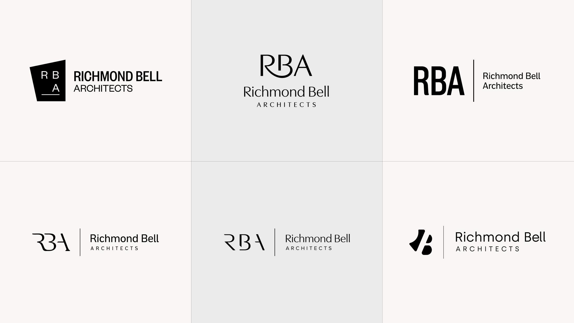
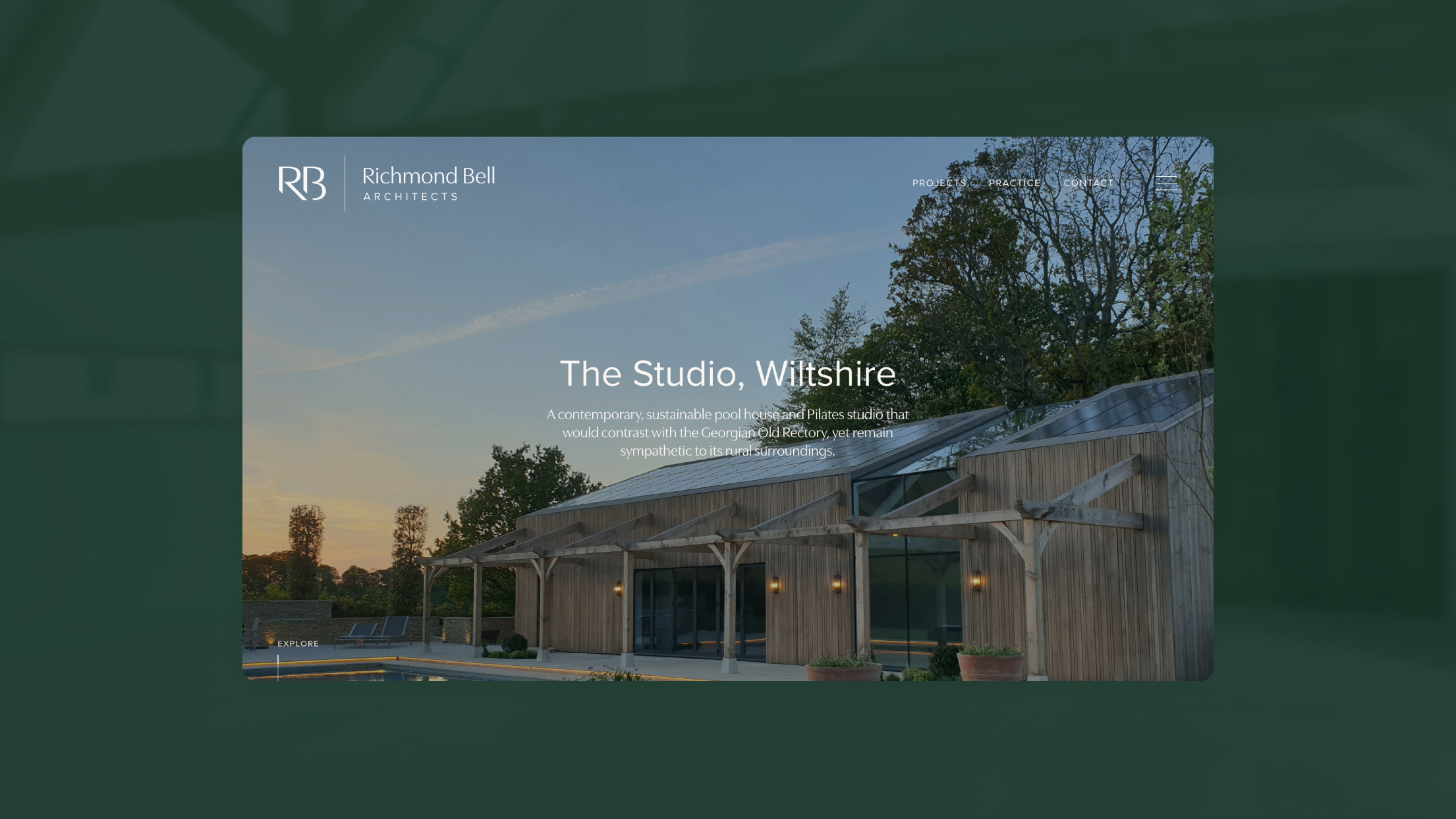
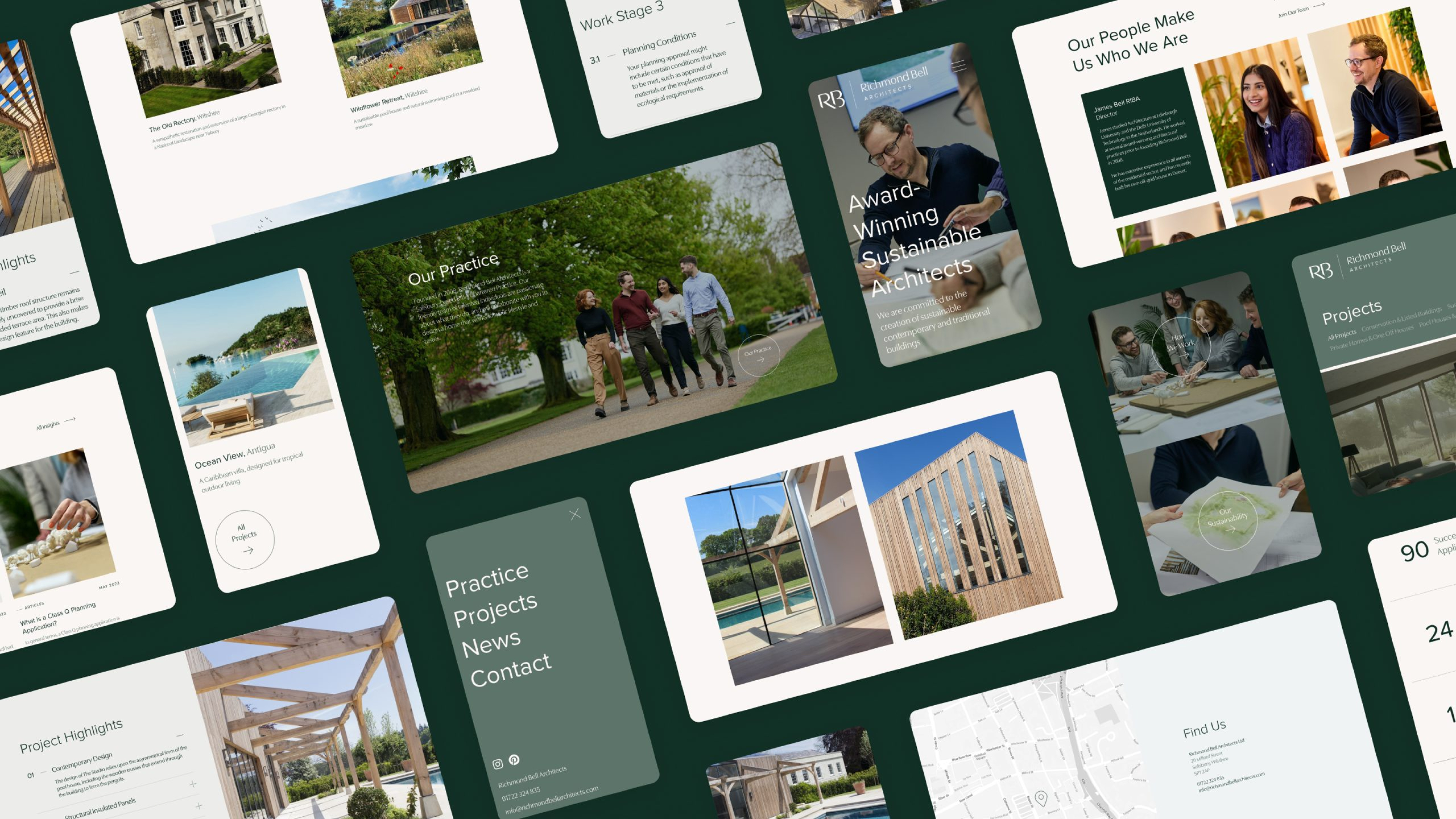
RBA’s website design reflects their identity in terms of its contemporary feel. Ample use of white space, offset imagery, and mirroring of the identity typefaces ensures brand and website are seamless.
Project Discovery
The Visual Information Hierachy was key to the User Experience of the RBA website; creating clear focus points and a defined content structure.
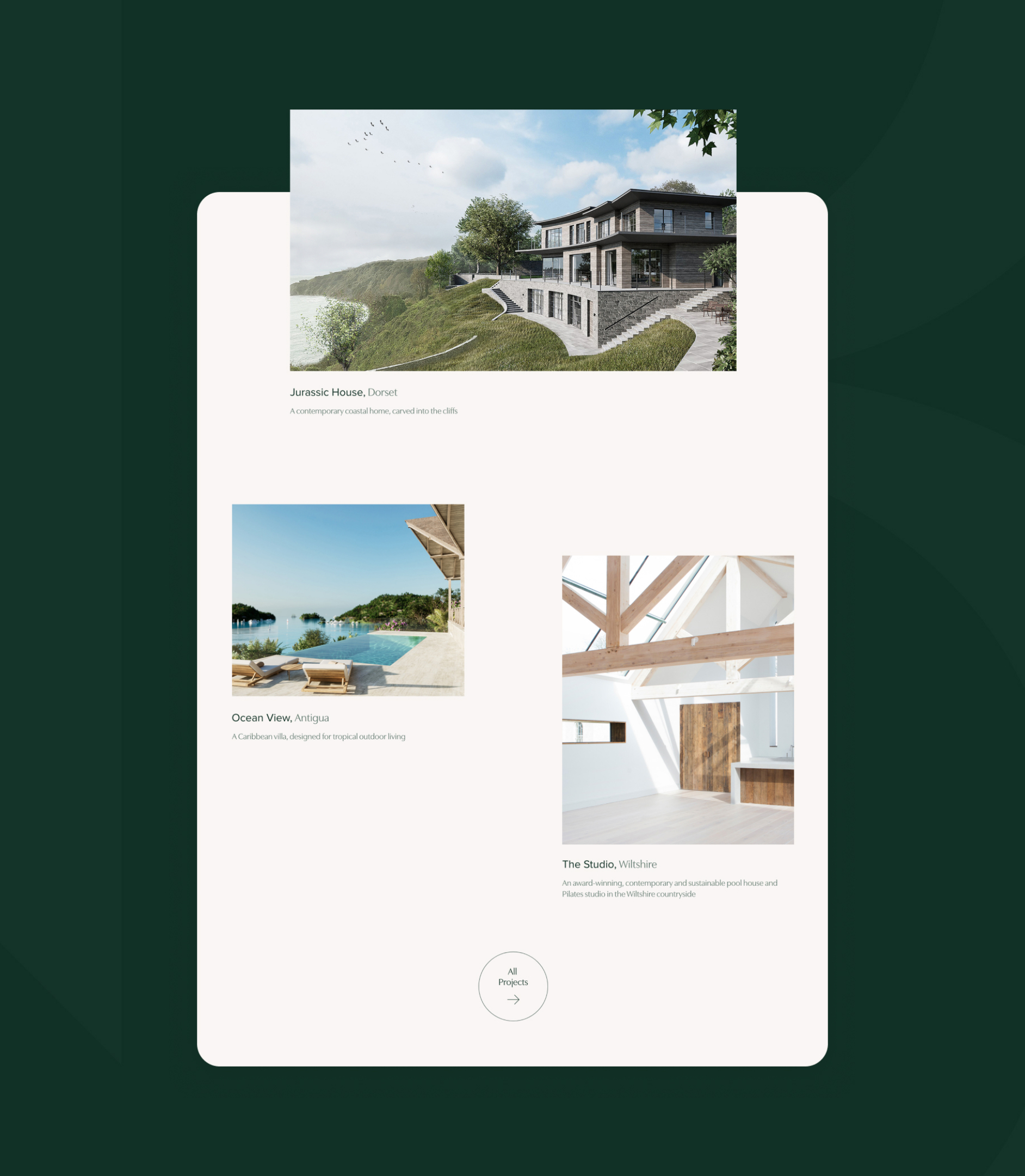
Because guiding prospective clients to RBA’s portfolio and making navigation accessible was so important, we proposed positioning tiled featured projects directly underneath the homepage banner area to initiate the user’s journey quickly and effectively. RBA can pick and choose which projects to sit within this featured area, tailoring what their clients see on arrival to the site.
Visual Appeal
RBA Salisbury, was keen to incorporate a cascading tile of project thumbnails on their project page, which we amped up with varying image sizes for visual appeal.
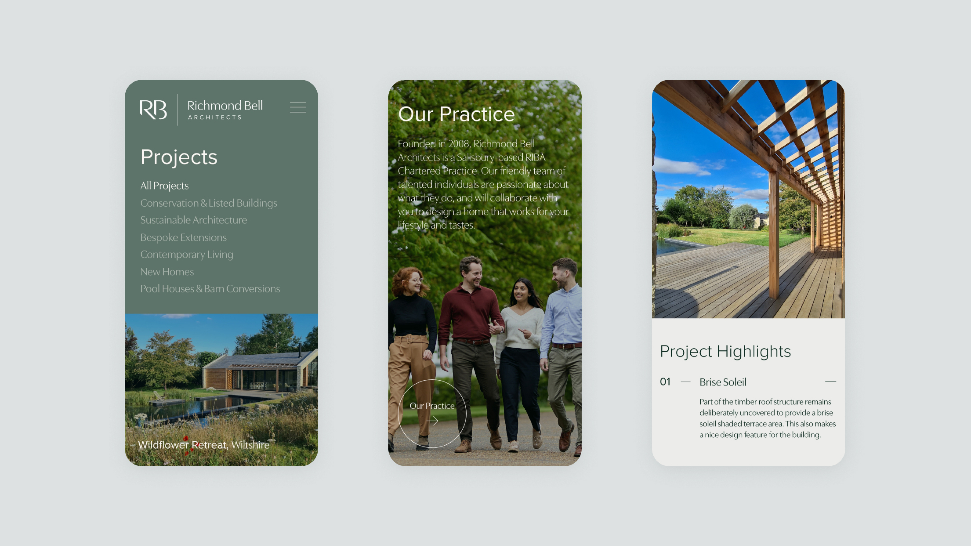
Large imagery on project pages showcases RBA’s work in fine detail, and incorporating a ‘Project Highlights’ accordion enables the user to view a breakdown of project detail in a small space.
Clear signposting throughout the site allows users to get in touch to discuss a project, whilst the sticky burger menu and navigation links enables users to navigate the site easily no matter where they are.
Responsive Design
Recognising that users browse on a variety of devices, we ensured the design adapts fluidly to desktops, tablets, and mobile phones. The user’s journey was central to our design process. We implemented UX best practices to make site exploration effortless, including a sticky navigation bar that remains visible as users scroll, providing constant access to key areas of the site. All call-to-action buttons and links were designed to be clear, prominent, and easy to click, guiding visitors intuitively towards project galleries and contact information.
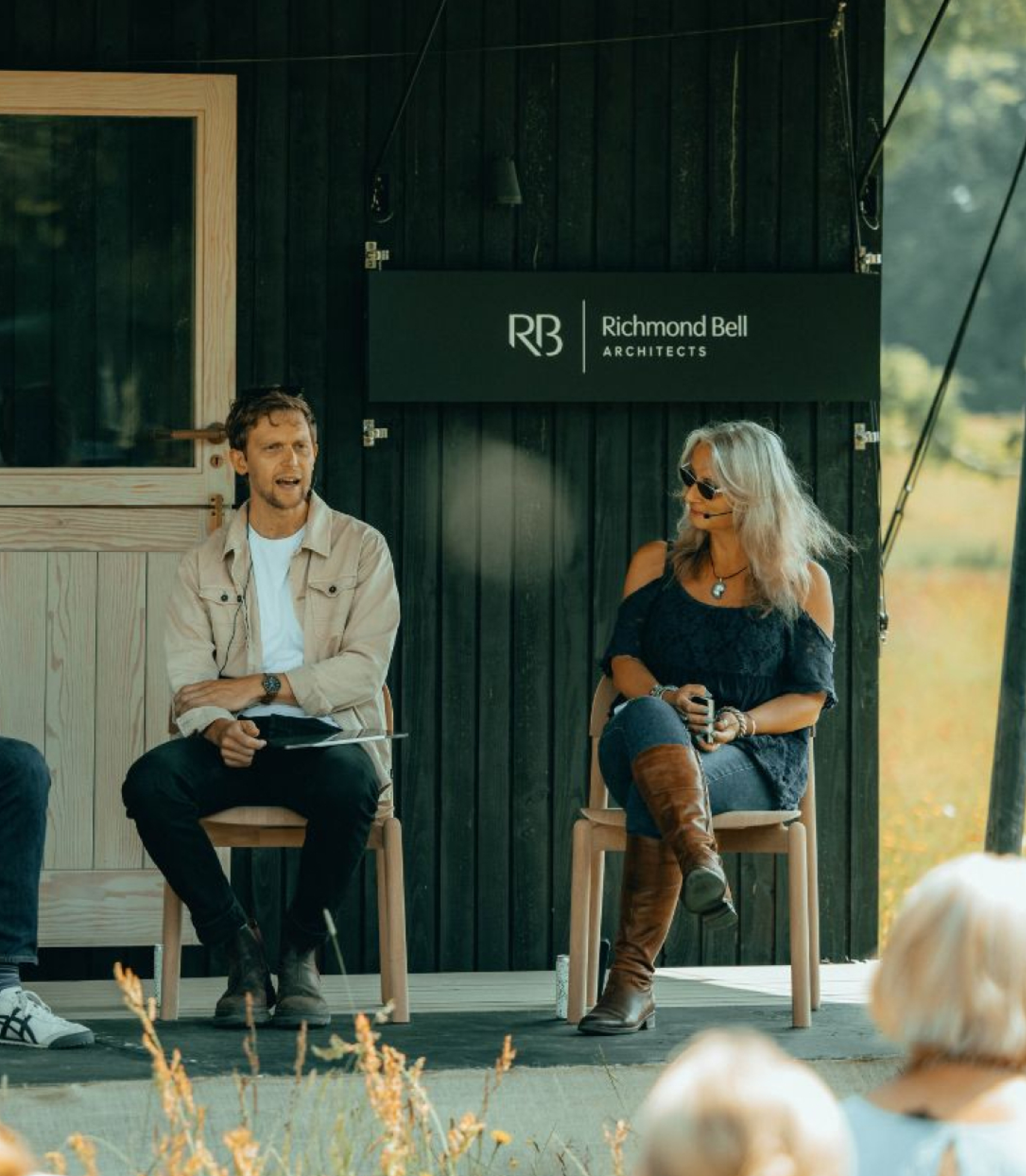
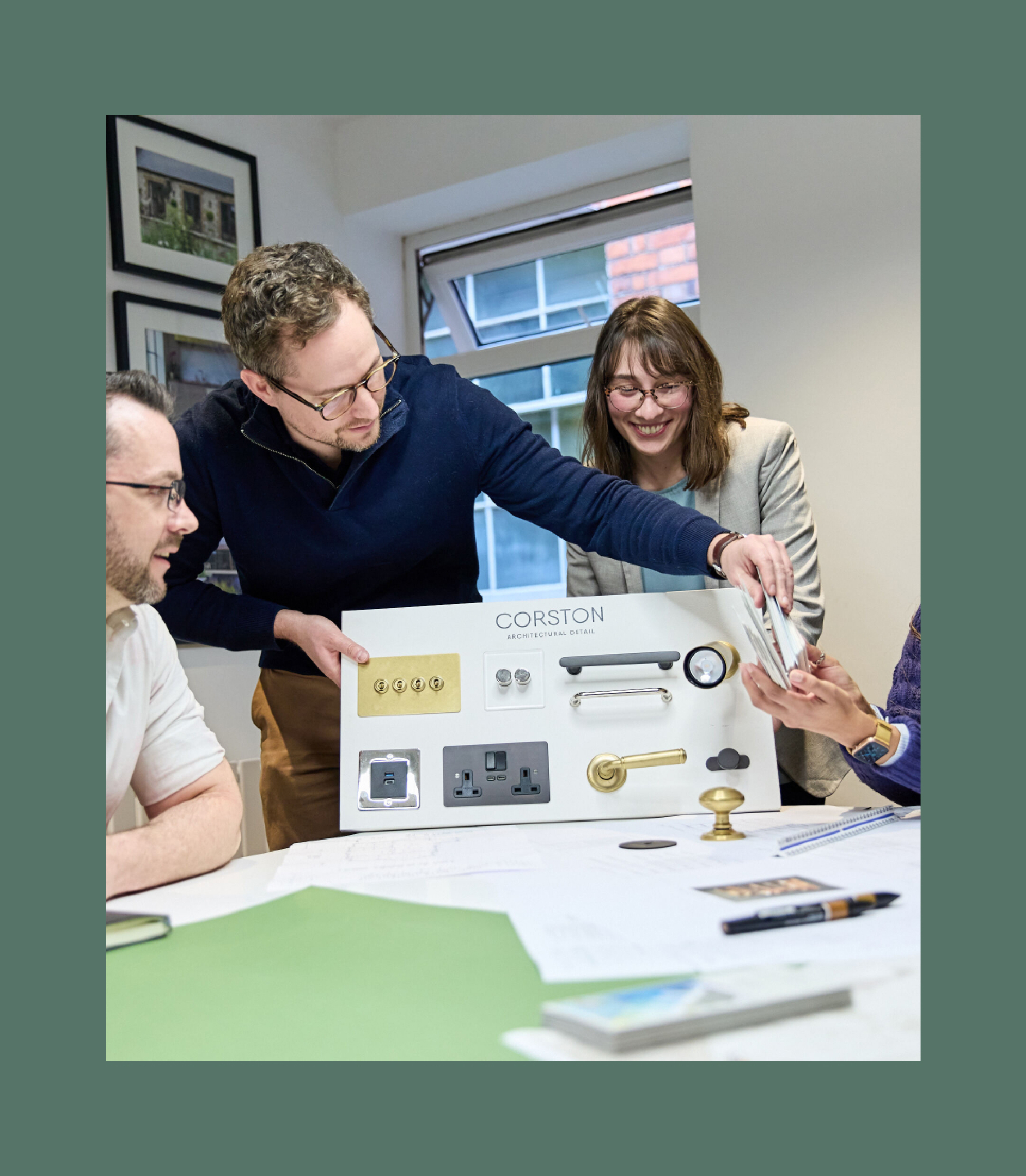
A Glimpse into the Studio
we captured a series of candid, lifestyle images within the Richmond Bell office. These photographs offer a behind-the-scenes look at the daily operations, showcasing the collaborative studio environment and the intricate process of architectural design. By highlighting the team in their natural workspace, these images help to humanise the firm, making them more relatable and transparent to potential clients.

Team Showcase
To complete the visual identity, we produced a full set of professional headshots for the entire team. To ensure the images were in keeping with the new brand, we used soft lighting, contemporary angles and as many natural materials in the frame as possible. The images are professional yet approachable, presenting a unified team of experts and providing a personal point of connection on the company’s website and marketing materials.
Results
A Cohesive Brand and Digital Experience
To resolve inconsistencies in the presentation of RBA’s previous identity, we defined a solid direction for the new brand and established a clear usage framework. The new brand identity and website design now complement one another, visually reflecting RBA’s position as a contemporary and sustainable practice. This ensures a cohesive and seamless experience for their clients, from the first brand interaction to the final project gallery.
