Haines Phillips: London Architects Website Design and Build
An architectural practice builDt on heritage & trust
Haines Philips’ previous website was cluttered, hard to navigate, very basic, and did not perform well in searches. We designed and built them a new site that enhances the user experience with intelligent functionality and navigation, whilst allowing content to be easily organised and discoverable by search engines.
Services
- Brand & Identity
- Development
- Web Design
Industries
- Architecture
Introduction
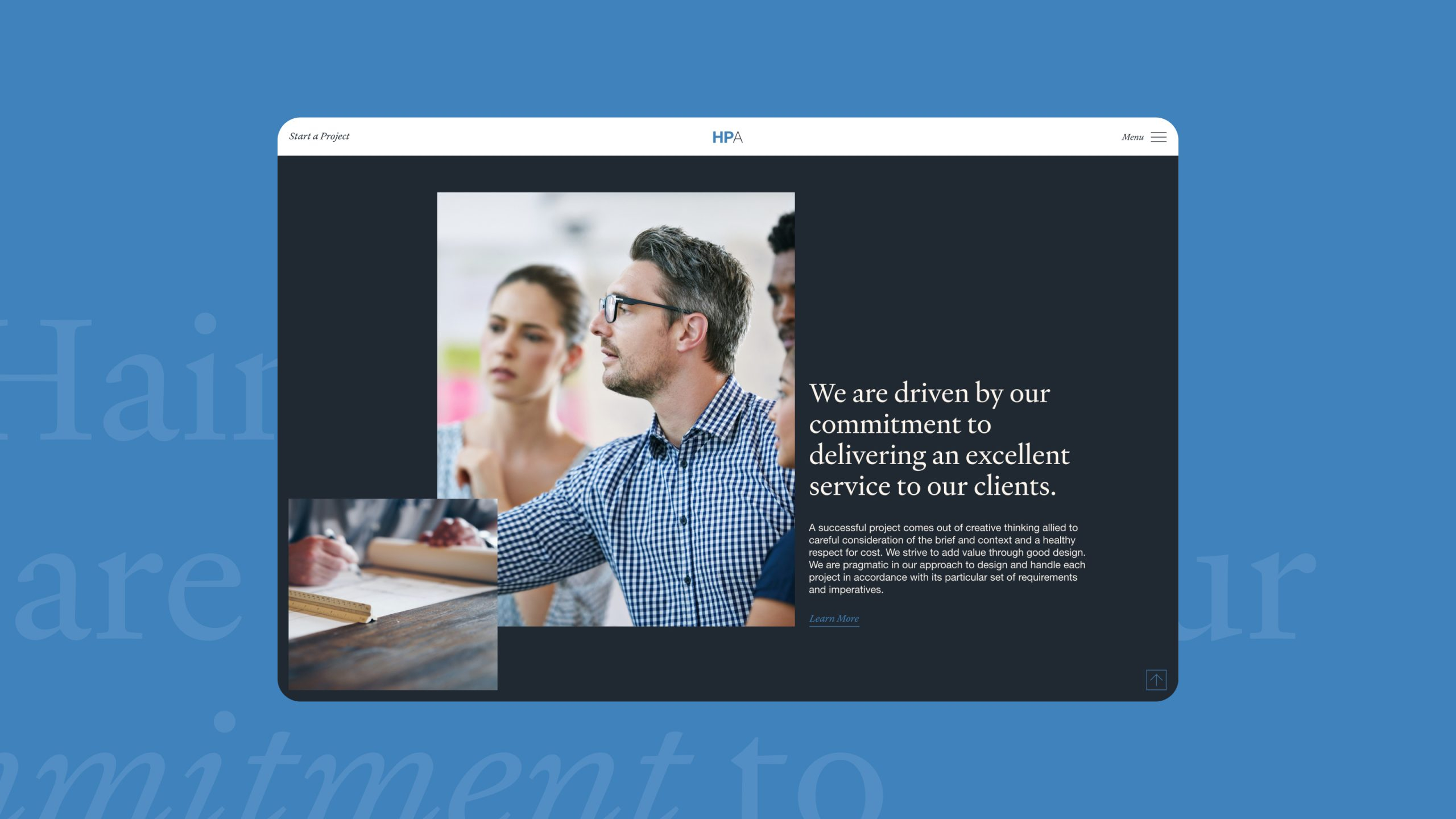
HPA needed their new website to better reflect their historical pedigree, breadth of skill, experience and portfolio to attract clients.
As a company that was formed as a result of a merger, their new website also needed to reflect both succession and new beginnings – highlighting their rich history, but looking to the future.
We began by updating the brand style – introducing a new colour palette and new fonts to elevate the existing brand identity.
Driving interaction through UX Design
The largest element of the website design process was an overhaul of the user experience; focussed on the new site map and user journey that we devised.
HPA has a very diverse portfolio including residential sector, high end developments, housing associations, large developments as well as specialised private client work, so it was important that clients could navigate the portfolio easily and seamlessly.
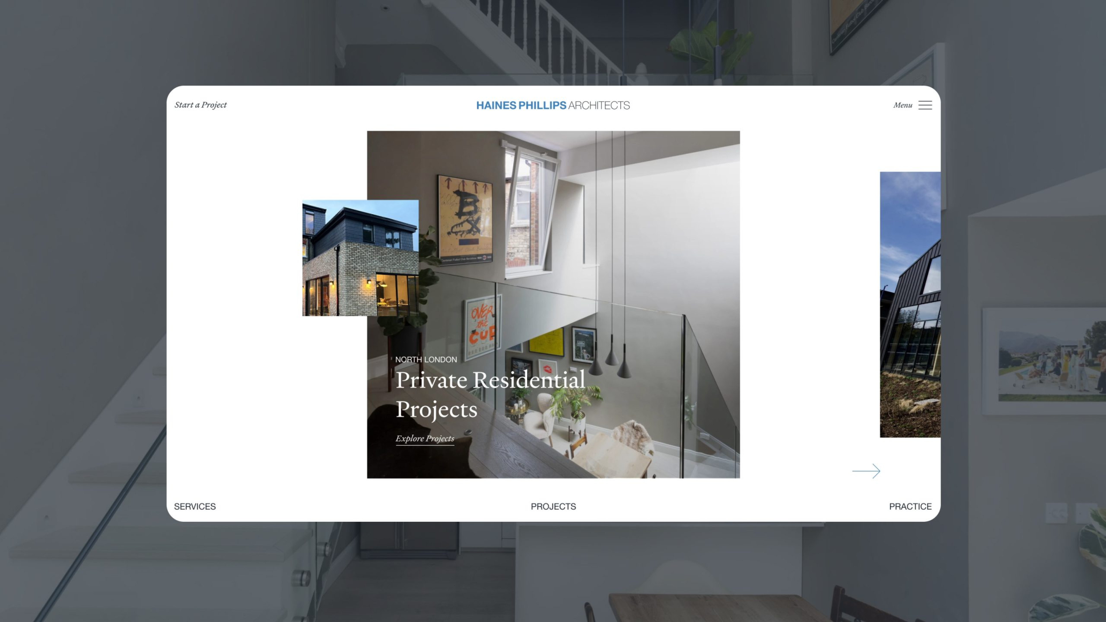
One example of how this was introduced can be seen on the homepage banner carousel, from where users can easily navigate straight to a pre-filtered list of specific projects based on geographical locations and type.
Presentations as refined as the projects themselves
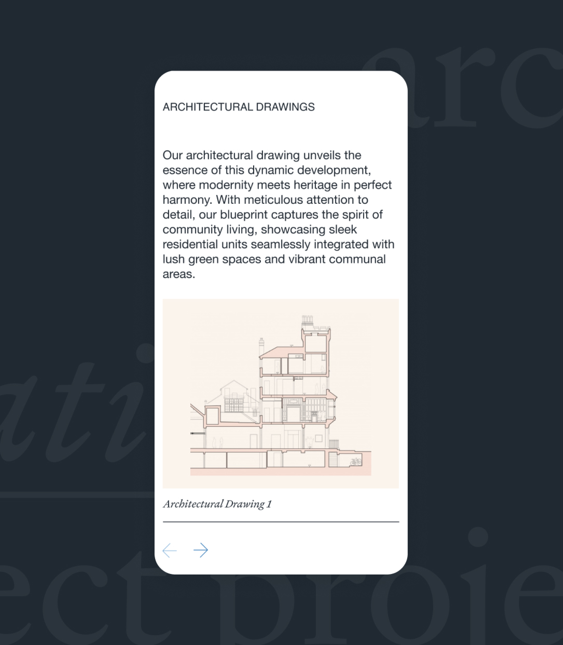
HPA have a huge number of project case studies, accompanied by stunning photography and architectural drawings. We placed a lot of focus on the project page template, ensuring it had plenty of appropriate flexible blocks to house content – and could be used to craft impactful case studies.
We created a height varying image carousel, complete with description and image caption, as an engaging way of containing drawings within a confined area on the page.
Responsive Design
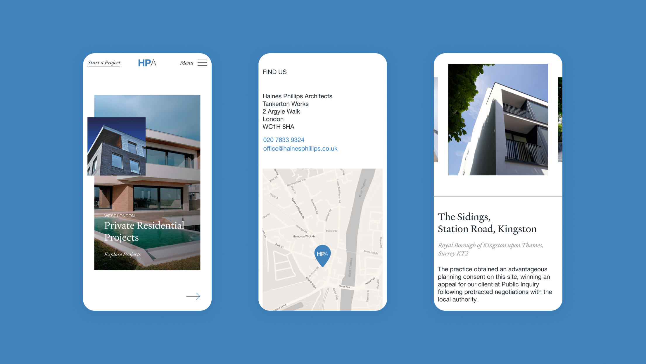
A crucial element of any project is responsive design; ensuring that a website looks good and performs well no matter the screen size. Haines Phillips was no different; with a lot of traffic coming to the site via mobile – particularly from their prospective private clients – it was crucial that project photos were given the space to shine, and that the projects map remained easy to navigate on a smaller screen.
The unconventional banner area we had built for HPA meant a slight rethink as to how it would perform on smaller devices. We adjusted image ratios to reflect the desktop experience, together with fine tuning CTA animations with presses in mind rather than clicks.
Interactive Project Discovery
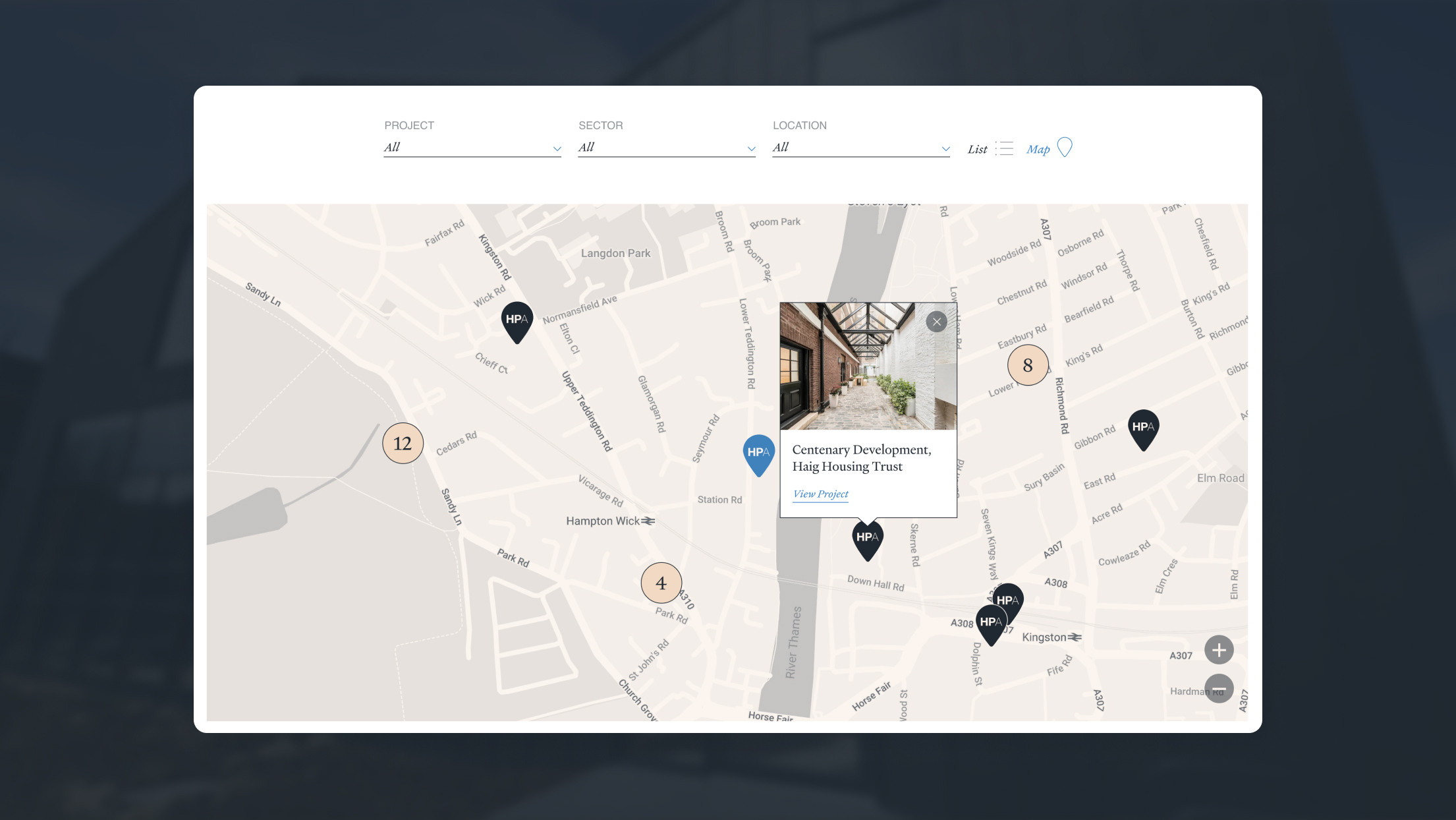
Haines Phillips were particularly keen to be able to showcase their portfolio across London and other parts of UK. It was also important to them to show prospective clients who were looking at a case study, that the practice had a lot of experience in a particular geographical area, and therefore knowledge on local planning regulations.
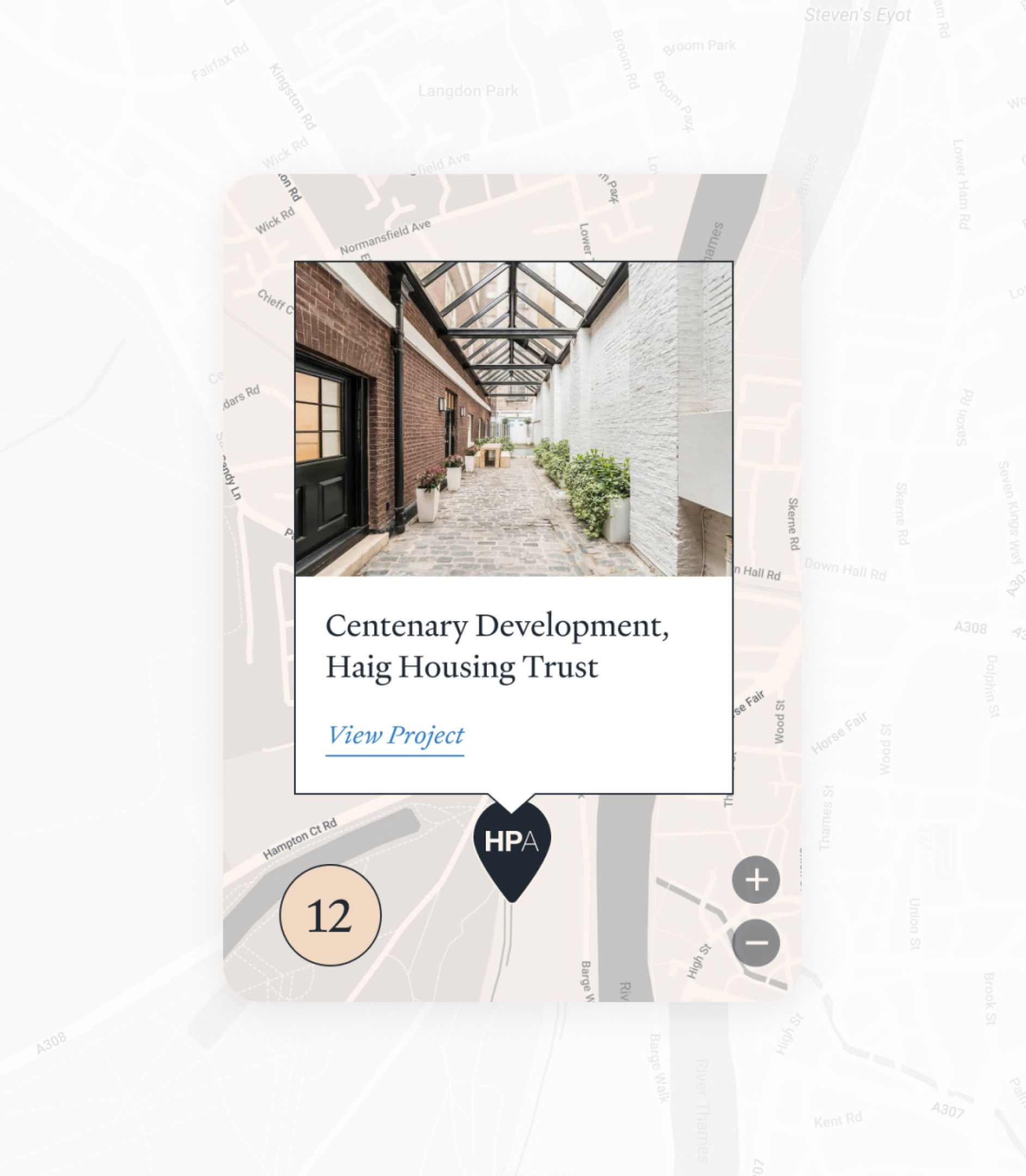
We designed and built a map that would not only give a clear visual representation of the breadth of HPA’s experience, but also help users navigate between projects.
Each project has the option to add a location tag which then displays as a location pin on the interactive map. When clicked, a thumbnail of the project displays with a link to view the project.

Summary
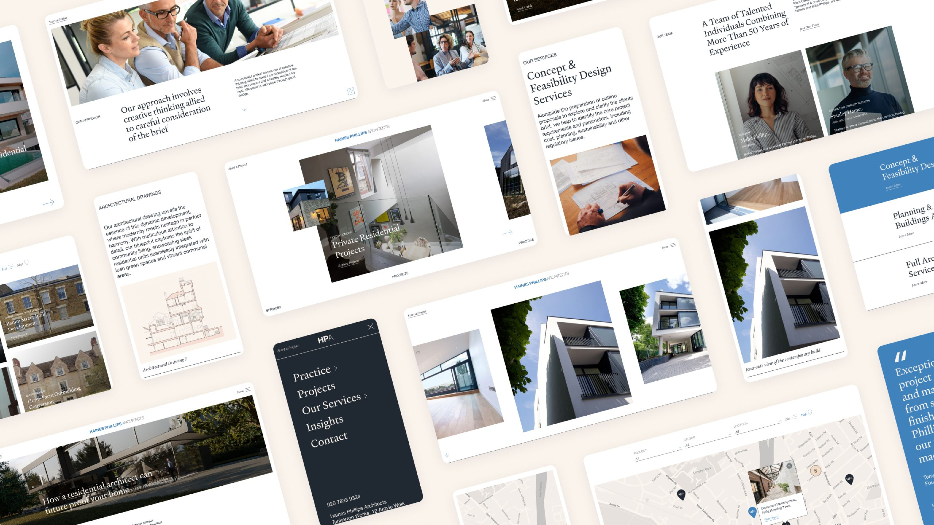
The new website design elevates HPA’s digital presence with a more immersive and engaging experience, which will increase awareness of their higher value architect projects, maximise search returns, target audiences from a geographic perspective and increase transparency in their process and diversity of work. The ‘open flow’ of the user journey allows users more freedom in their journey on the site, and together with the contemporary, minimalist design ensures Haines Phillips have a website that truly reflects themselves as a professional, approachable architectural practice.
Results
“Our website hadn’t been updated for over 15 years and needed a full overhaul and optimisation for SEO. Giant Peach offered us a competitively priced service to re-build it from the ground up to give it a more polished look and contemporary functionality whilst developing the brand identity from the old website. This creative ‘front-end’ was matched by work behind-the-scenes to raise our profile online. Emails and phonecalls were fielded promptly so that the project ran smoothly and Giant Peach continue to offer us support with their hosting service.”
Piers Carlisle RIBA – Partner
