Consistency in Your Visual Brand Identity
When it comes to setting up and growing a business, the development of a solid, consistent visual brand identity is something that’s often neglected sob. We get it – there are so many demands on a small business owner’s time; orders, inventories, invoicing, suppliers, tax returns – that dedicating attention to this important part of marketing often falls by the wayside.
SME founders often choose an image and a font, smush them together in Powerpoint and make do as long as possible. But sooner or later, it becomes clear that there’s a problem. That logo is the wrong shape for an Instagram profile image. It looks weird on a letterhead. The colour is limiting options for a new product line’s packaging. The font feels outdated. So different versions are created to try to fill the gaps – which only creates another problem; it starts to get really inconsistent.
Which leads us to one of the most common questions we get asked by clients: “What can I do to make my brand more consistent across all the places I use it?”
The first thing to point out is: great question! Asking shows an understanding of the power of consistency in a brand – but what exactly lies behind that power? Why is consistency so important?
Here’s why…
- Memorability: To state the obvious, consistency breeds familiarity. When your brand is experienced in the same way across different platforms, consumers develop a sense of trust and recognition, with your brand becoming more memorable every time.
- Professionalism: If you don’t take your brand seriously, why would a customer think you take your product or service seriously? A consistent brand identity not only signals professionalism, but reliability and dependability.
- Differentiation: We all know it’s a fight for every single second of consumers’ attention. Consistency reinforces what makes your brand unique, making it easier for customers to recognise and choose you over alternatives.
- Simplifying Comms: A consistent brand identity framework actually makes the job of marketing and communicating infinitely easier by ensuring your messaging remains clear and consistent across all channels, with different options and formats for a multitude of uses. Again, this is encouraging brand recall and making it easier for customers to engage with your content.
- Scalability: As a business grows, maintaining consistency becomes even more important, as the risk of dilution increases. A strong brand identity lays the groundwork for scalability, enabling you to expand into new markets and audiences with confidence.
So with that in mind, what is it important to work towards on a practical, achievable level we hear you ask? Read on…
Logo
K.I.S.S.: Even if your logo looks beautiful, it’s not going to be useful if you can’t use it for a range of different commercial ways. A lot of brands have simplified because their unique type styles or design elements weren’t working as well on digital – obviously a massive barrier to comms

(We’ve been there too)
Harmonise and Isolate: Your brandmark (the image) and wordmark (the name) need to work together, and on their own. You’re aiming for a couple or more different iterations of the combination. It’s as simple (!) as side by side, one on top of the other, close together or spread out.
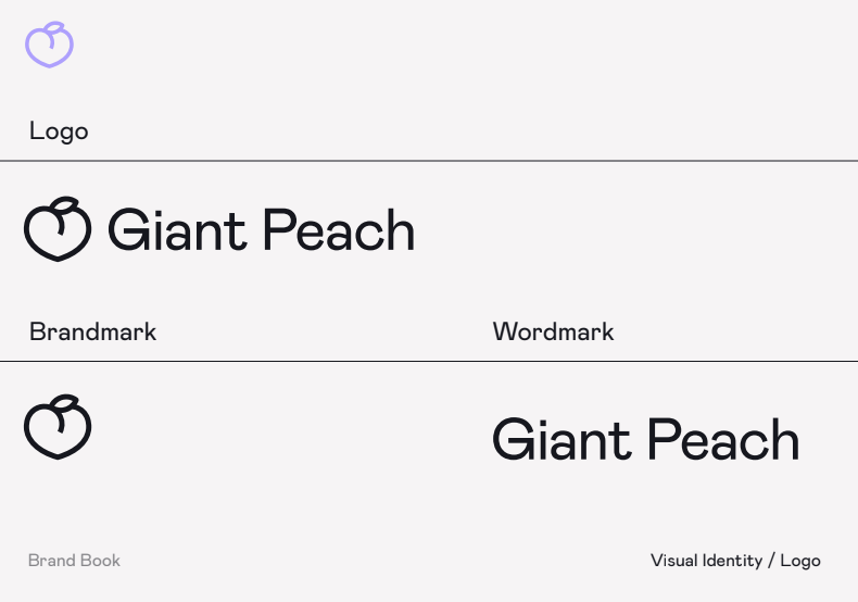
The right files: Trust us, you’re always gonna need black and white versions, options with a transparent background and different sizes (from a pixels POV), so you can scale up the size as needed without ending up with a hot blurry mess
Colour
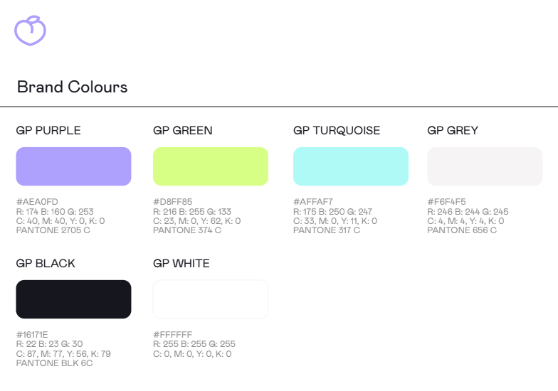
Know your colour palettes: If your brand is seen on packaging or in print, it’ll need to be CMYK or use a Pantone colour scheme to ensure it’s reproduced consistently everywhere. It’s surprising how monumentally different colours can look IRL
Be Disciplined: Choose one key colour that will take the lead, while any others are there to complement and support.
Representation: Choosing a colour that represents something (green for sustainability, red for energy etc) and has a deeper meaning or connection to the brand can only be a good thing, building a more consistent and personal identity.
Typography
Choose one font that reflects your brand’s personality
If you want to, pick one or two more which complement the hero font – but make sure that one of these is easy to read when consuming large amounts of text. Then use these consistently across all communications. For example – stick to the same font for your social media posts, website headings and brochures.
Practicalities
Write yourself a Brand Style Guide and stick to it: Create a comprehensive brand style guide that outlines your brand’s visual elements, including logo usage, colour palette and typography. You can also include tone of voice and image guidelines to create a true bible. This guide serves as a reference for anyone creating content for your brand, ensuring that all materials adhere to the same standards
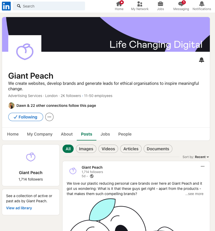
Social Media Presence: Maintain consistency in your social media profiles by using the same profile picture (usually your brandmark) and cover photo (where applicable) where possible.

Website Design: Keep your website design consistent with your brand identity by using the same colours, fonts, and imagery as other marketing materials. Maintain consistency in layout of the pages – with the same font and size used for different types of content and headers.
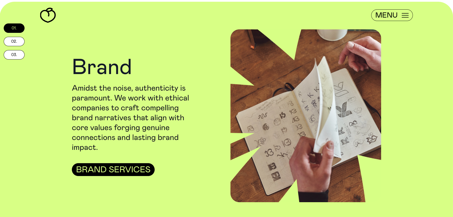
Regular Audits: Conduct regular audits of your branding materials across all channels to identify any inconsistencies and address them quickly. Regular maintenance helps ensure that your brand identity remains strong and cohesive over time.
If you’d like a little bit of help getting your brand ship shape and working a bit harder for you, you know who to call (that’s us 😉 ) – or book in a call to chat more in depth with our fearless leader, James, here.
More Updates Delivered!
"*" indicates required fields
Read this next
Read this next

