PFLA: Brand Identity and Web Design

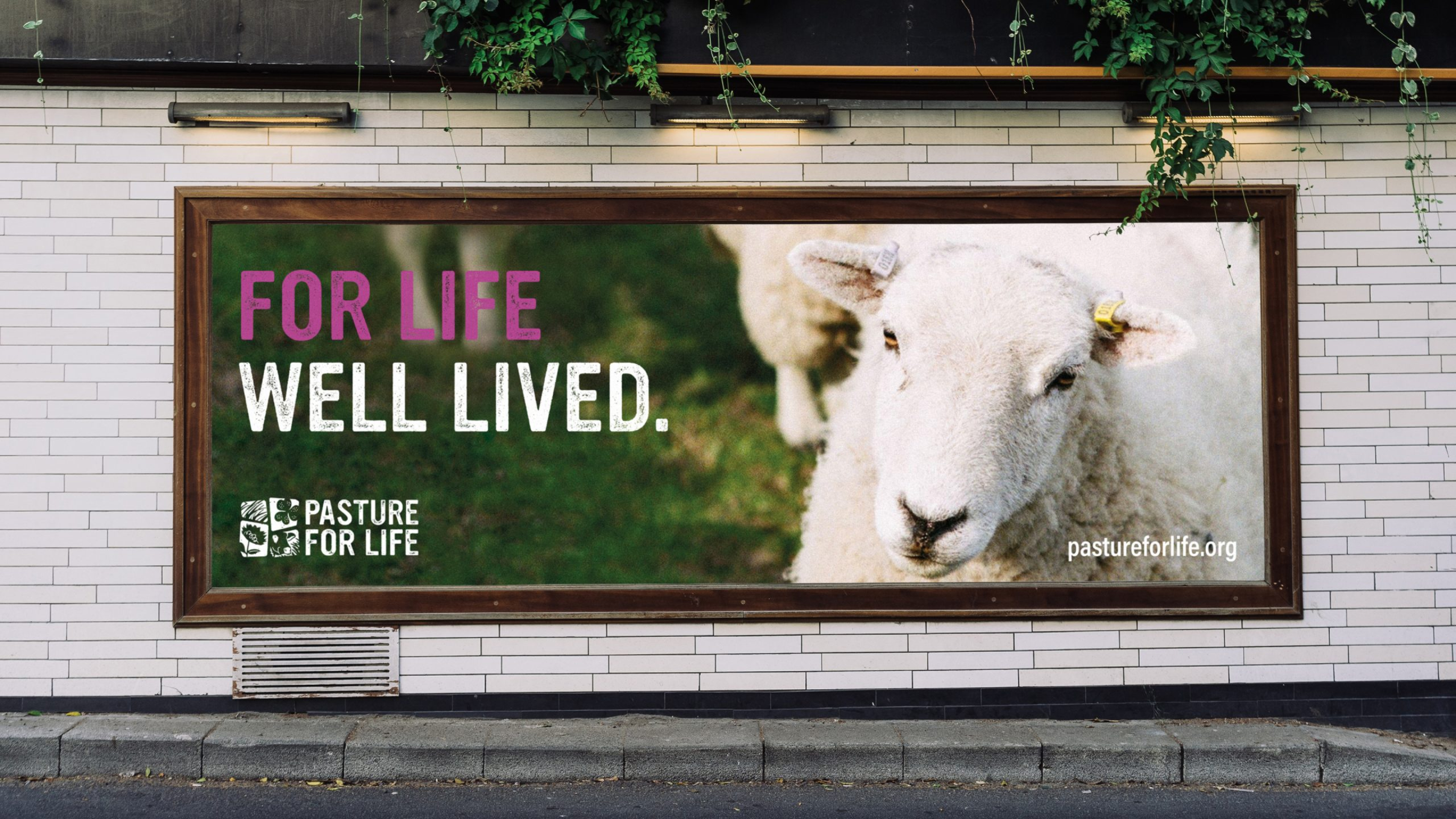
for life well lived
Redefining the UK’s leading 100% pasture fed certification movement
Services
- Brand & Identity
- Web Design
Industries
- Farming & Agriculture
Overview
Pasture for Life is a diverse movement which champions the restorative power of grazing animals on grass. From farmers to butchers and artisans to academics, Pasture for Life works together with its community to certify 100% pasture-fed meat and dairy products.
Goal
We partnered with Pasture for Life to create a fresh, re-energised visual identity along with a certification mark and brand messaging.
Our objectives; introduce a clearer separation between brand and certification mark, and reflect brand values and key messaging more effectively.
Unique, fresh and vibrant visual identity
The process
During the brand design process, we explored the use of simplistic shapes to ensure visibility across a range of size scales. The identity needed to be recognisable on both large format point of sale assets and small-scale product labelling.
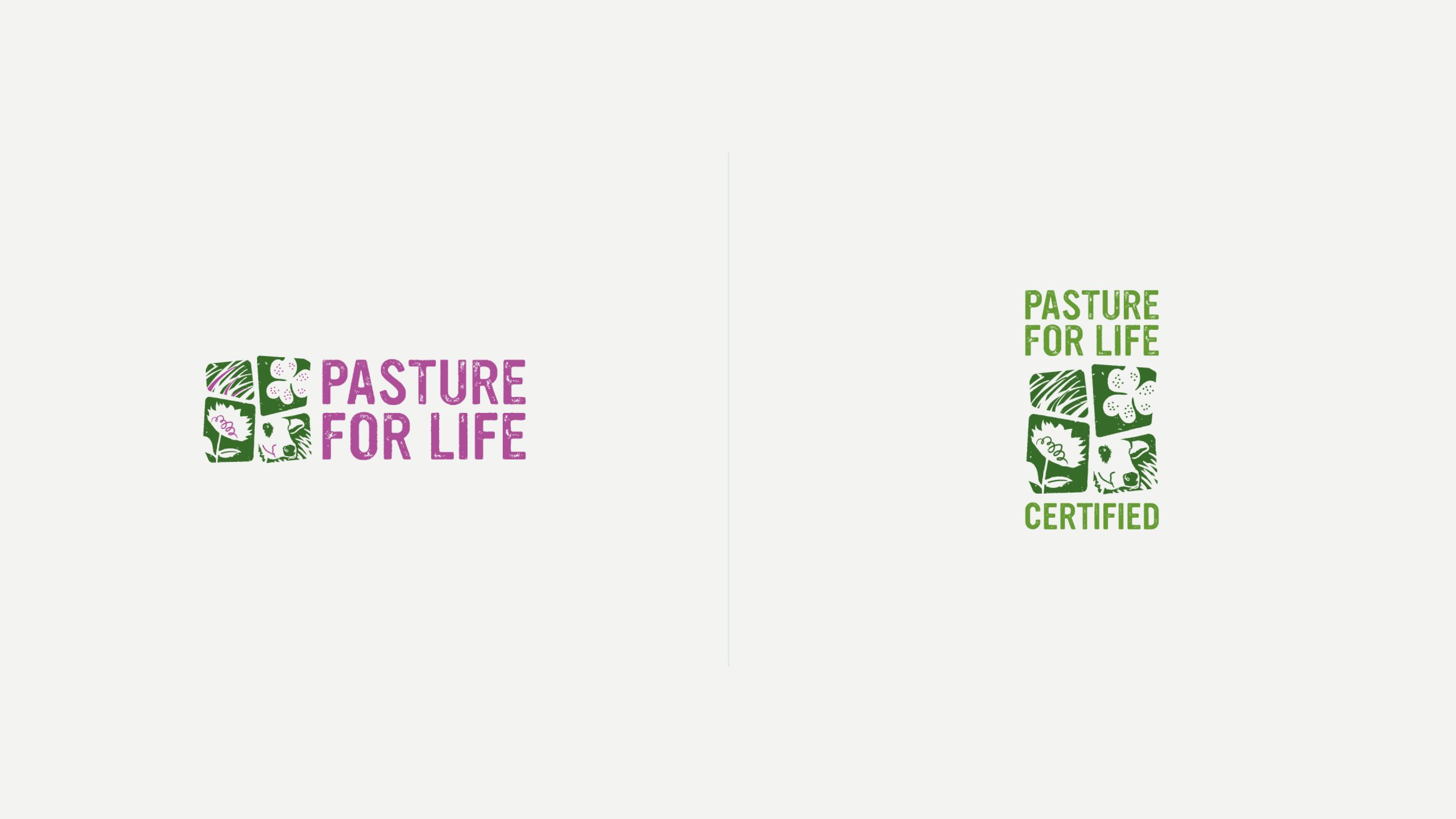
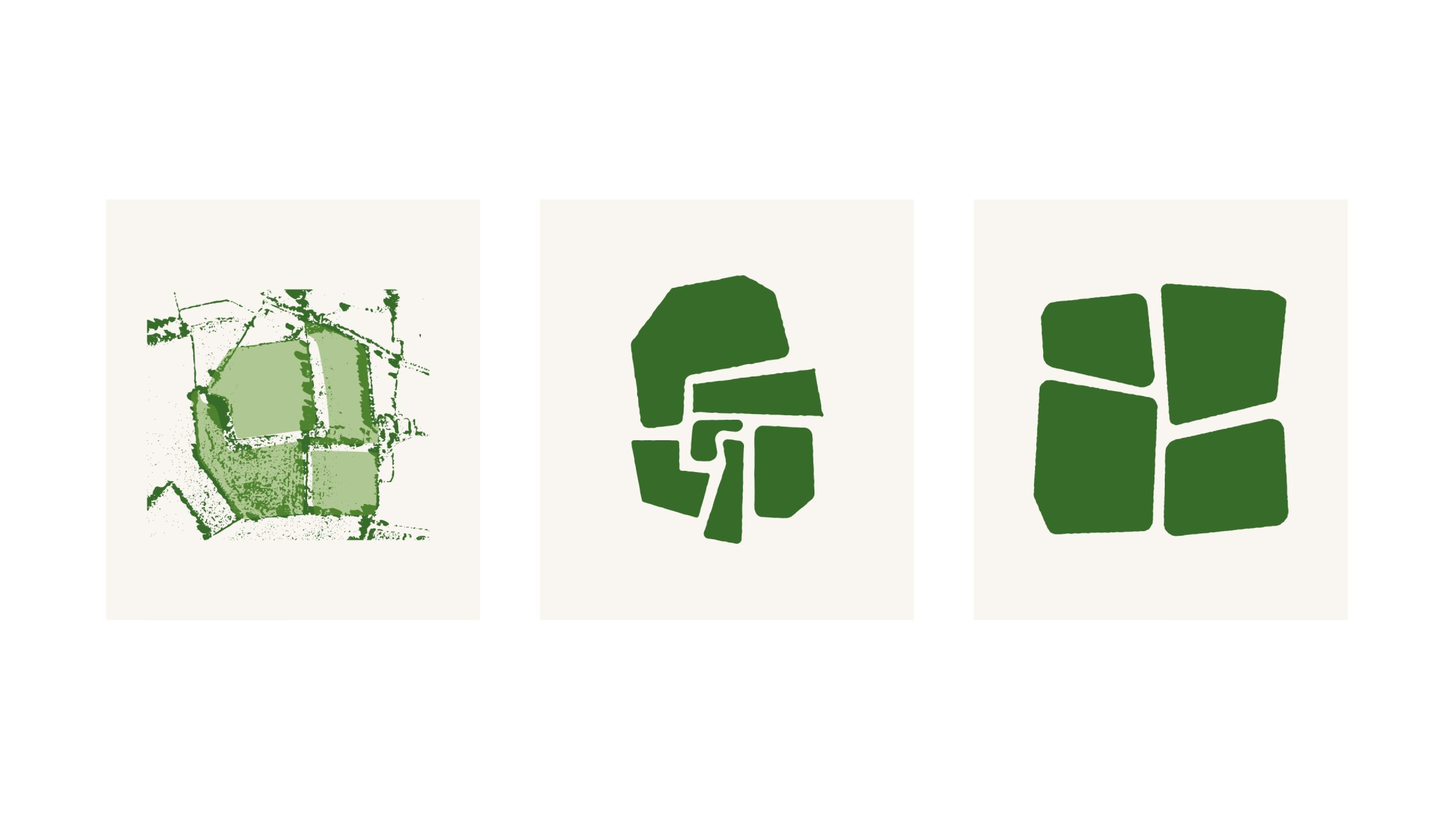
The initial identity concept consisted of four base shapes, influenced by an aerial photograph of adjoining pasture fields. Working into the base shapes, we toyed with the idea of integrating the PFLA letterforms before quickly discarding this approach in favour of an independent wordmark. We focussed on introducing block print style illustration to honour Pasture for Life’s strong ethical and rural values.
the process
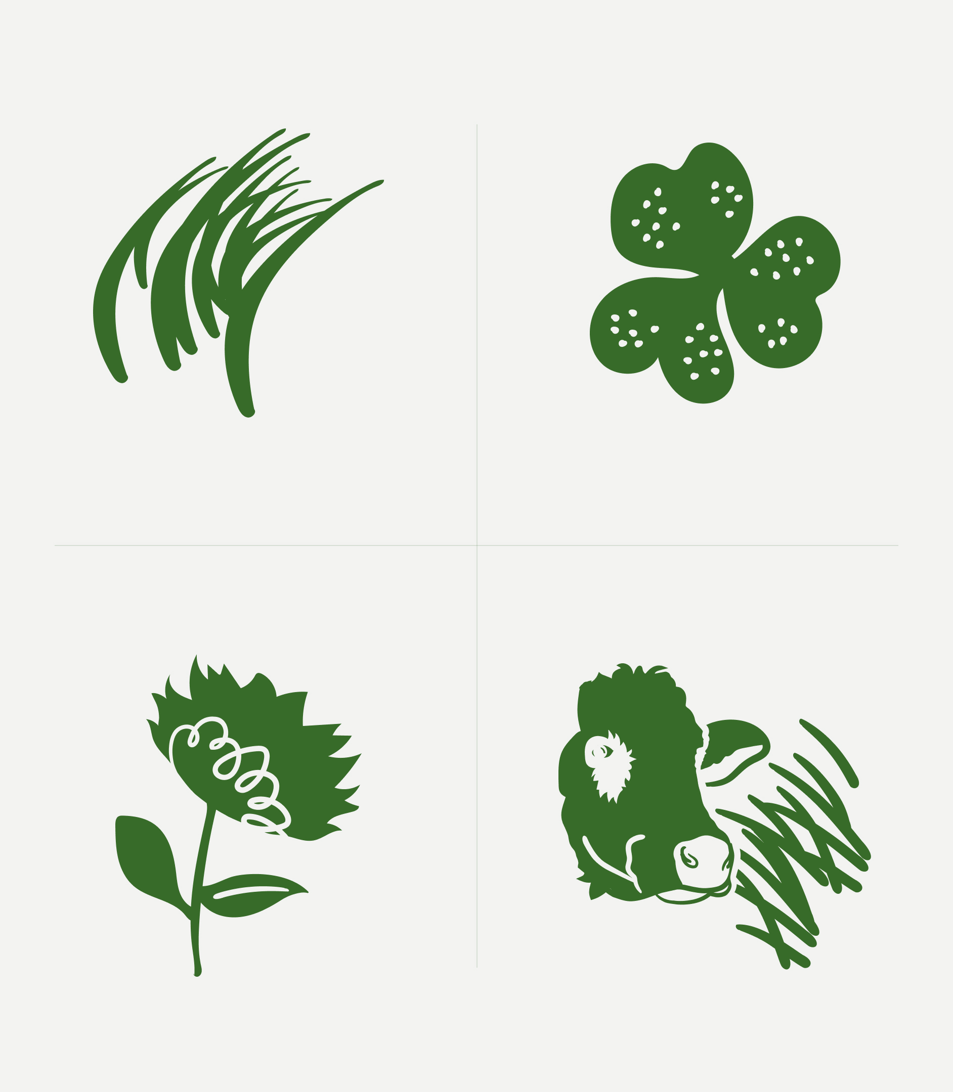
With our block style printing and hand stamped influences, we set to work designing four individual silhouette illustrations, housed by our base shapes to create 4 ‘tiles.’ The silhouette imagery references common pasture forage such as herbaceous legumes, plants and grasses, in addition to a ruminant animal based tile to round off the agricultural focus.
A block letterpress style wordmark accompanies the tile brandmark, complete with an organic roughened texture treatment applied to the edges of shapes and block fill areas across the entire identity.
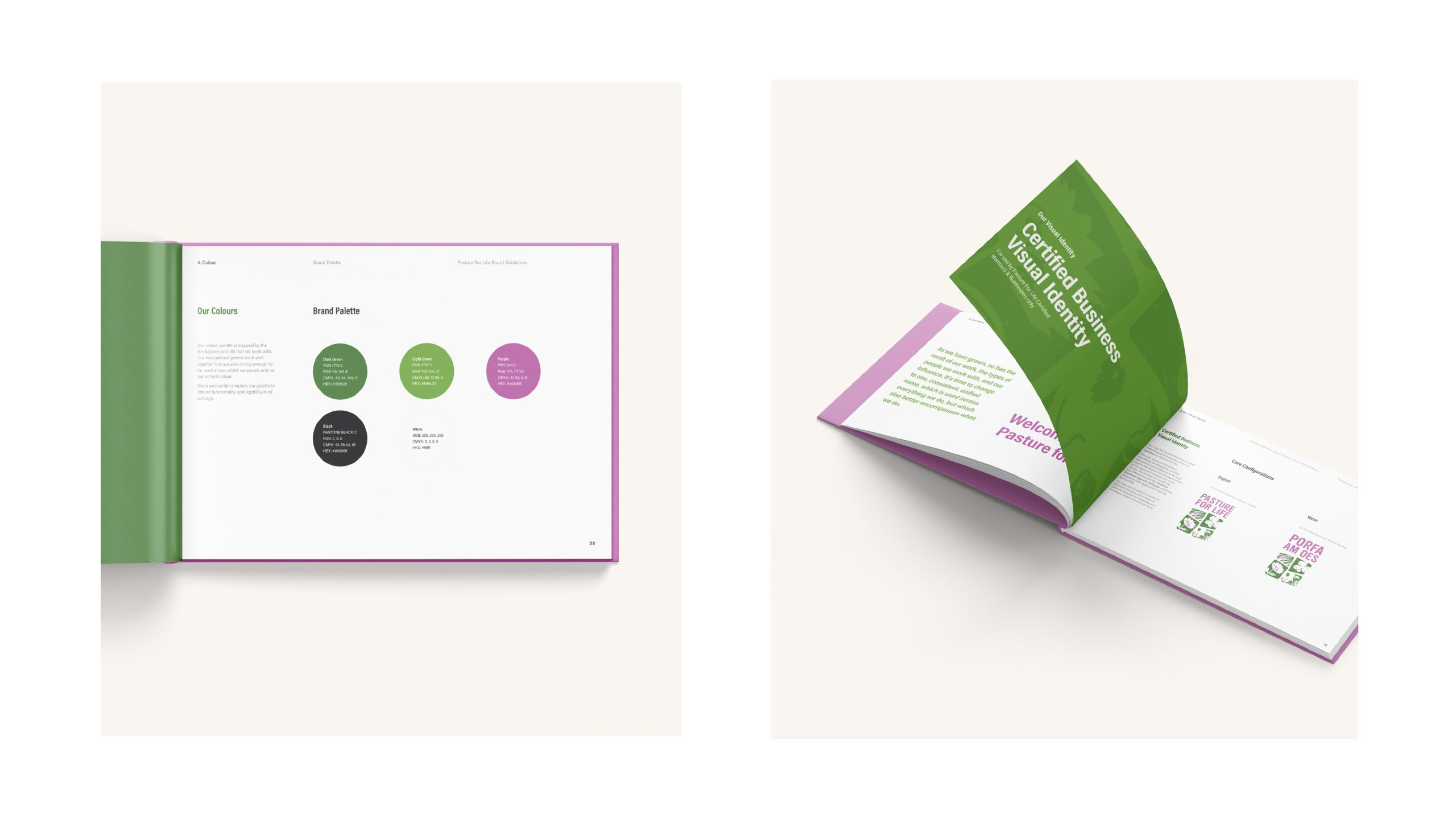
The identity also has several lock up and colour options dependent on its usage, along with both English and Welsh language variants.
the process
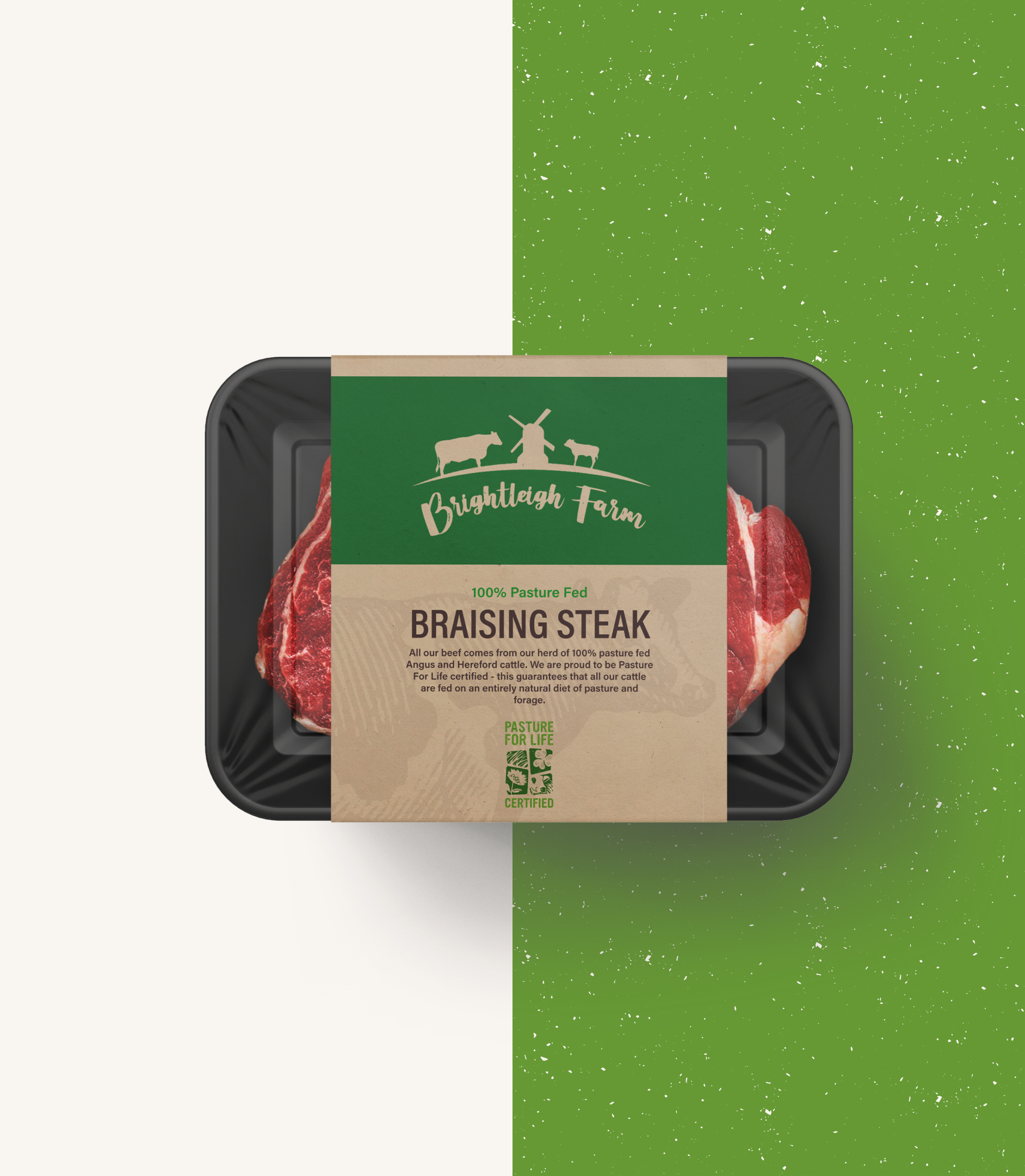
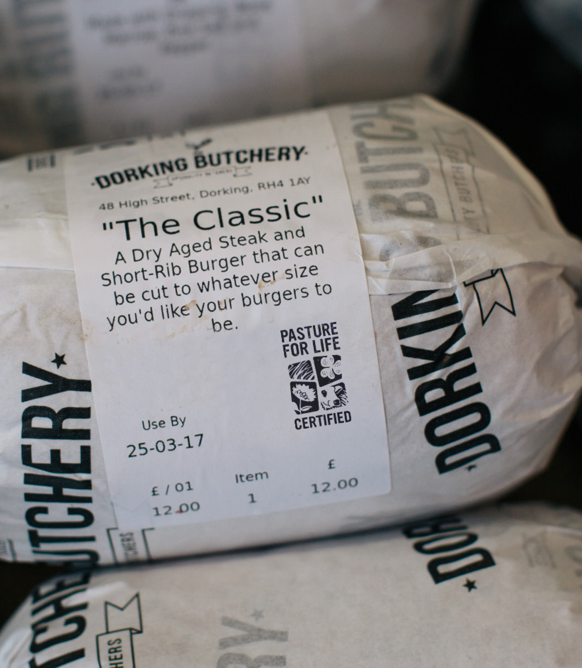
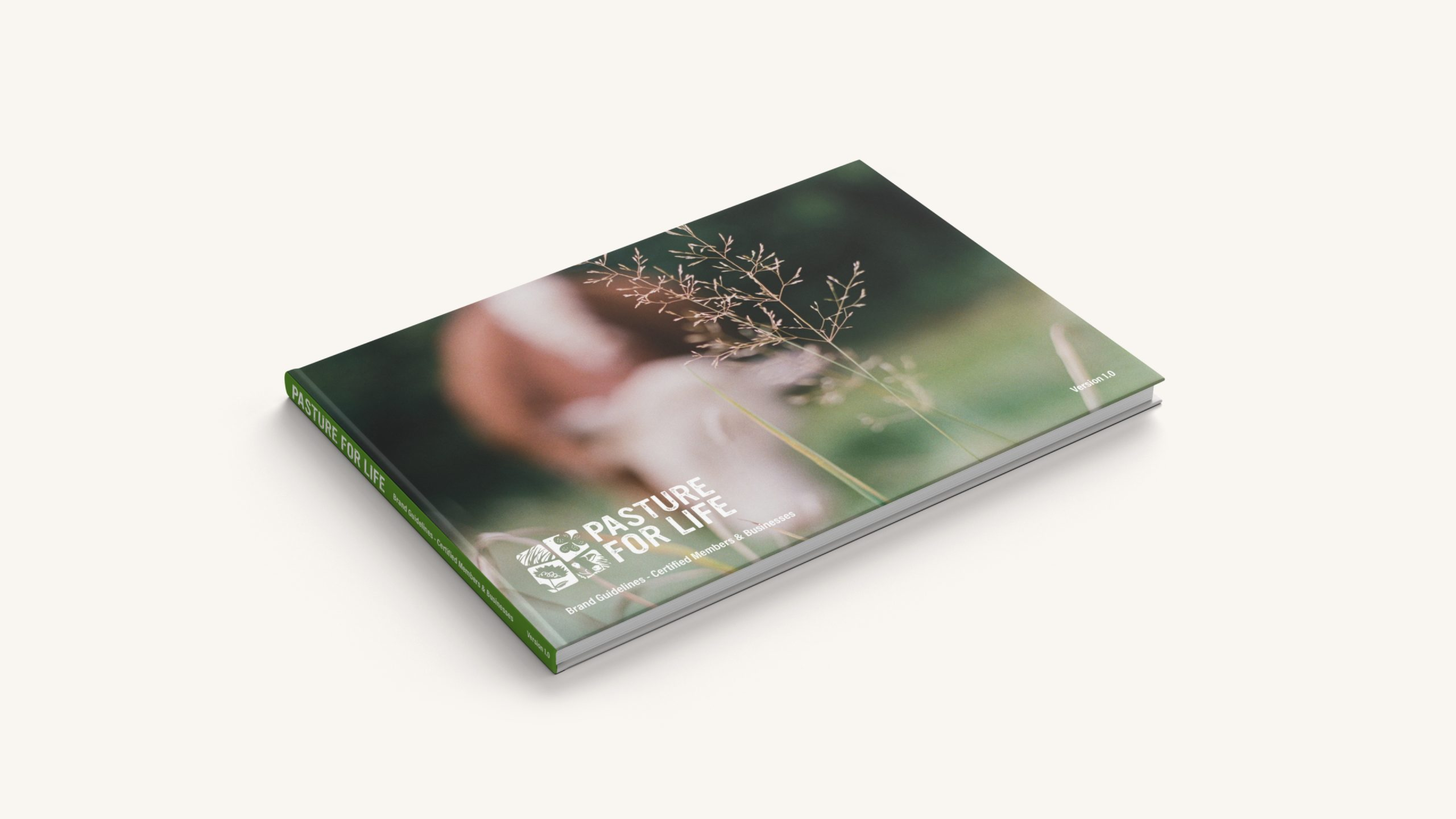
We produced a comprehensive set of brand guidelines for the Pasture for Life brand, outlining the identity usage for each of the three user types; Organisational, Certified Members and Certified Product. The document serves as a reference point for demonstrating how Certified Members could display their certification.
the process
Pasture for Life encourages their members to get creative when integrating their certification within their own branding or packaging.

the process
With visual identity and brand guidelines firmly established, Pasture for Life commissioned Giant Peach to produce further branded assets. An iconography set illustrates the benefits of Pasture for Life, designed with identity consistency in mind; block printed silhouette illustration with organic, roughened textures applied.
the process
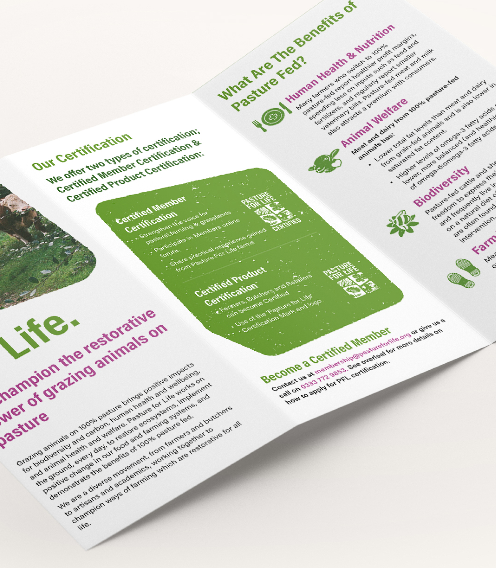
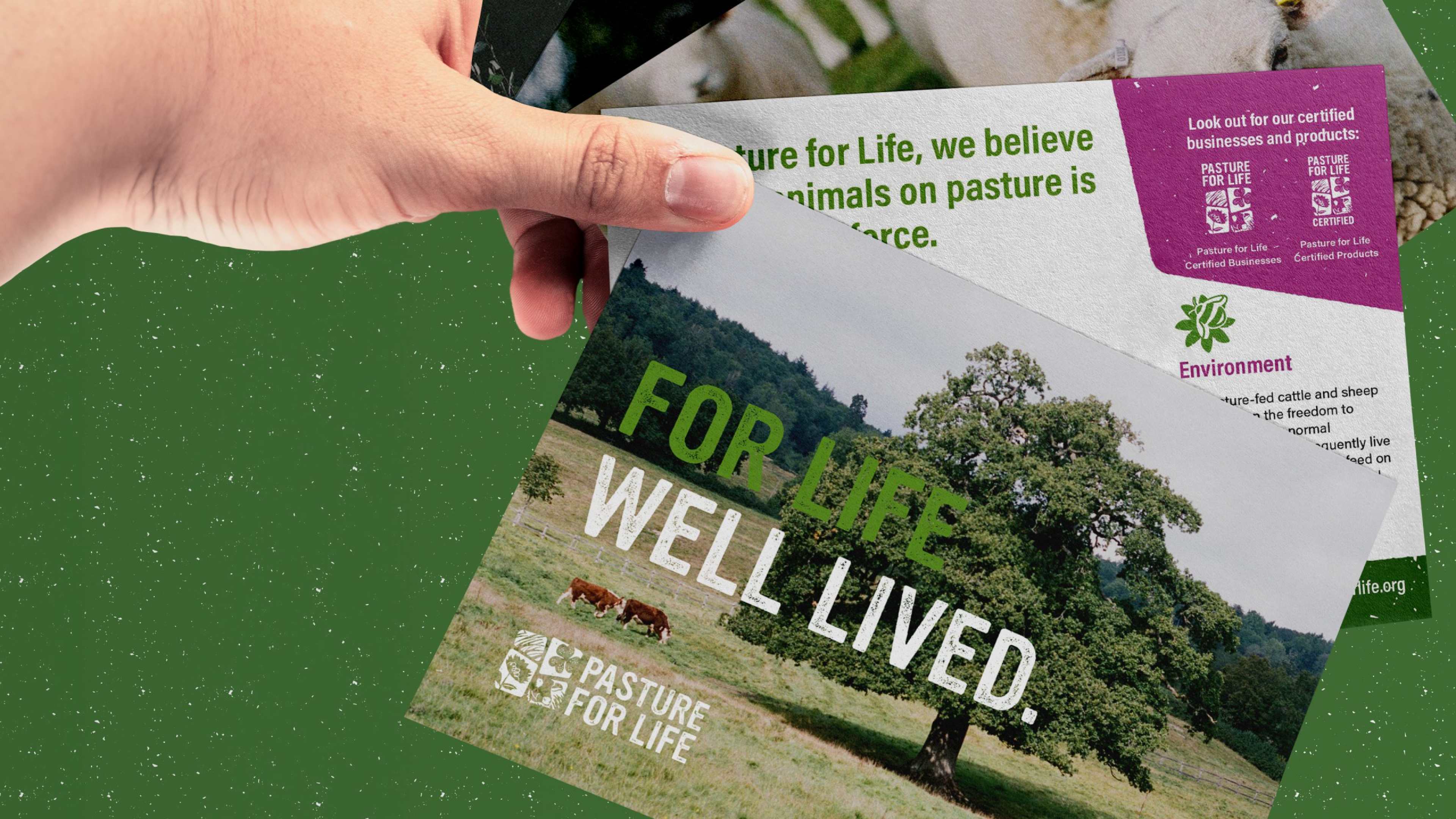
We also created a tri-fold leaflet, social profile and post assets, presentation deck templates, email newsletter templates and a set of A5 postcard style leaflets.
the process
We delivered a series of key messaging workshops and exercises, working closely with Pasture for Life to redefine their primary messages and core values. The outputs of the workshops yielded a strong focus on the brands’ collaborative and pioneering values together with bold and radical statement message pieces such as ‘New Traditionalists,’ ‘Boldly Transparent at Every Turn’ and ‘Championing The Power of Pasture’.
The rejuvenated key messaging helped shape further branded assets such as A5 promotional postcard leaflets and website design concepts.
