Glaze: Brand Identity
Sip like a local
Glaze isn’t just about cups. It’s about the mood. The ritual. Committed to mindful living, Glaze sought to reinvigorate the reusable cup market with a rebrand that encourages taking a moment, being present and sipping responsibly. Their ambition was to create a brand with genuine personality and emotional depth, transforming a simple object into a meaningful part of a daily routine.
Services
- Brand & Identity
- Development
- Web Design
Industries
- Circular Economy
An icon for the everyday adventurer
About the brand
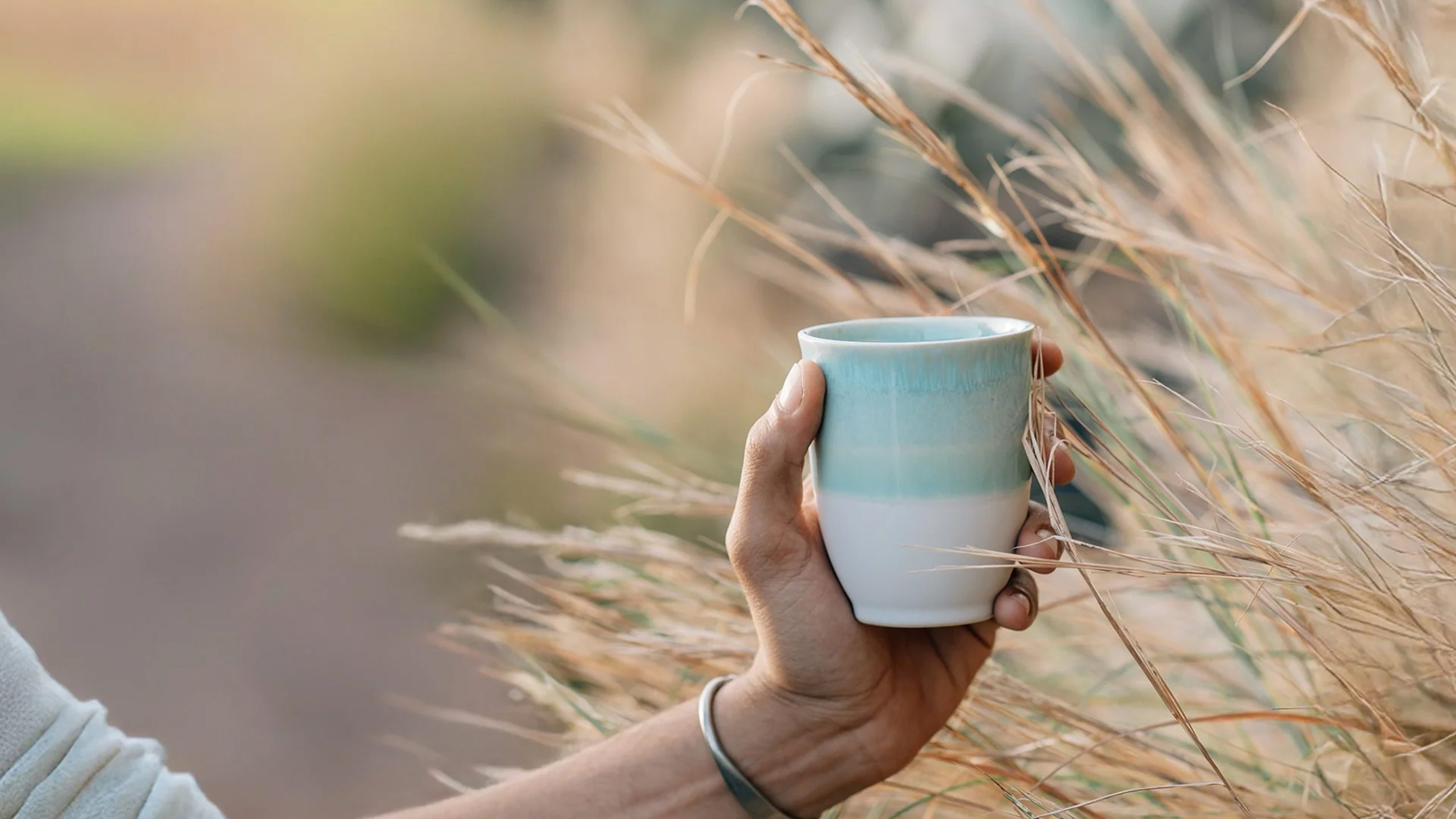
Founded in 2020, Glaze has earned a reputation as a favourite among coffee drinkers and baristas for their beautifully fired, handmade ceramics that grab attention without compromising taste. Each cup is a testament to quality, designed to feel good in your hands and make your daily coffee a moment to look forward to.
Expertly made in Portugal, the stoneware construction ensures that the flavour of the coffee remains pure and untainted, a direct response to the metallic or plastic taste common in other reusable cups. While their product was already exceptional, the brand’s story hadn’t yet caught up. Glaze had a loyal following but needed a stronger, more consistent identity to reach a wider audience and fully express its unique character.
A full rebrand to take Glaze from reusable to unforgettable
We partnered with Glaze to deliver a complete brand overhaul, covering everything from core strategy and visual identity to packaging and digital presence. The mission was to build a brand that felt both aspirational and personal, moving beyond the product’s function to celebrate the experiences it holds. We needed to create an identity that could anchor their story in travel, turning each cup into a keepsake from a life well-travelled.
The reusable cup market is crowded with products that are functional but forgettable. Traditionally, they come at a cost to the user experience; plastic and metal construction affects taste, and the designs often lack any real style or personality. Nobody truly loves their reusable cup.
Our goal was simple: create a brand that feels personal and full of possibility. We needed to break through a saturated market by building an emotional connection. The challenge was to design a comprehensive brand world that was flexible enough to stretch across packaging, photography, and digital storytelling, embedding the cup into the fabric of a daily ritual and positioning it as an essential accessory for life’s adventures.
More than a cup, a story of timeless adventure
Inspired by each cup’s unique character and naming convention, our strategy positioned Glaze as a spirited travel companion. We framed each Glaze cup as a collectible, a memento of a journey taken or a dream of one to come. The brand identity needed to reflect the unique and imperfect nature of the hand-made ceramics, celebrating character over conformity.
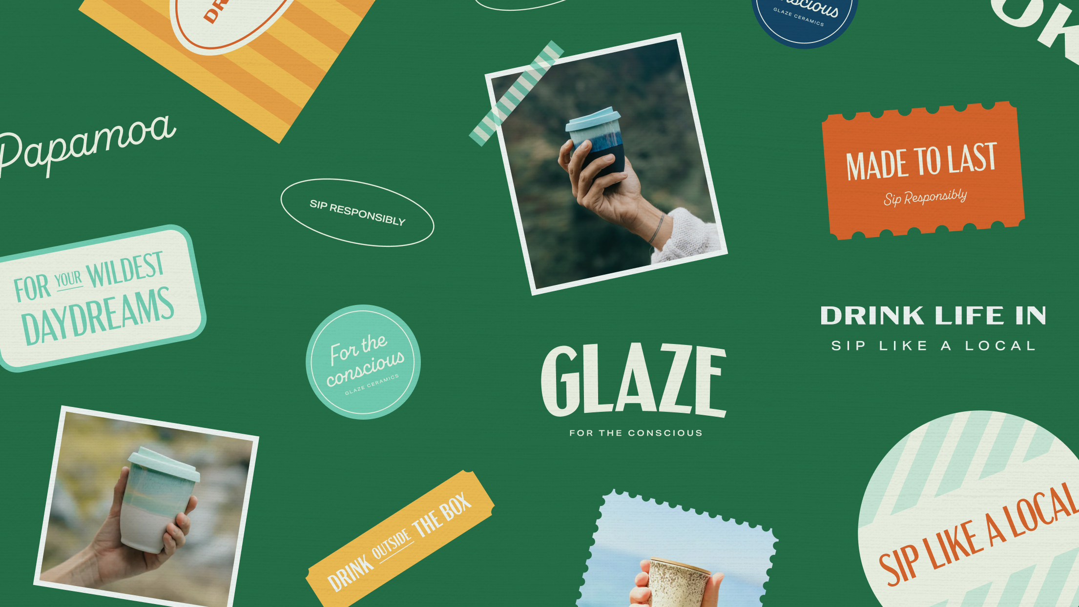
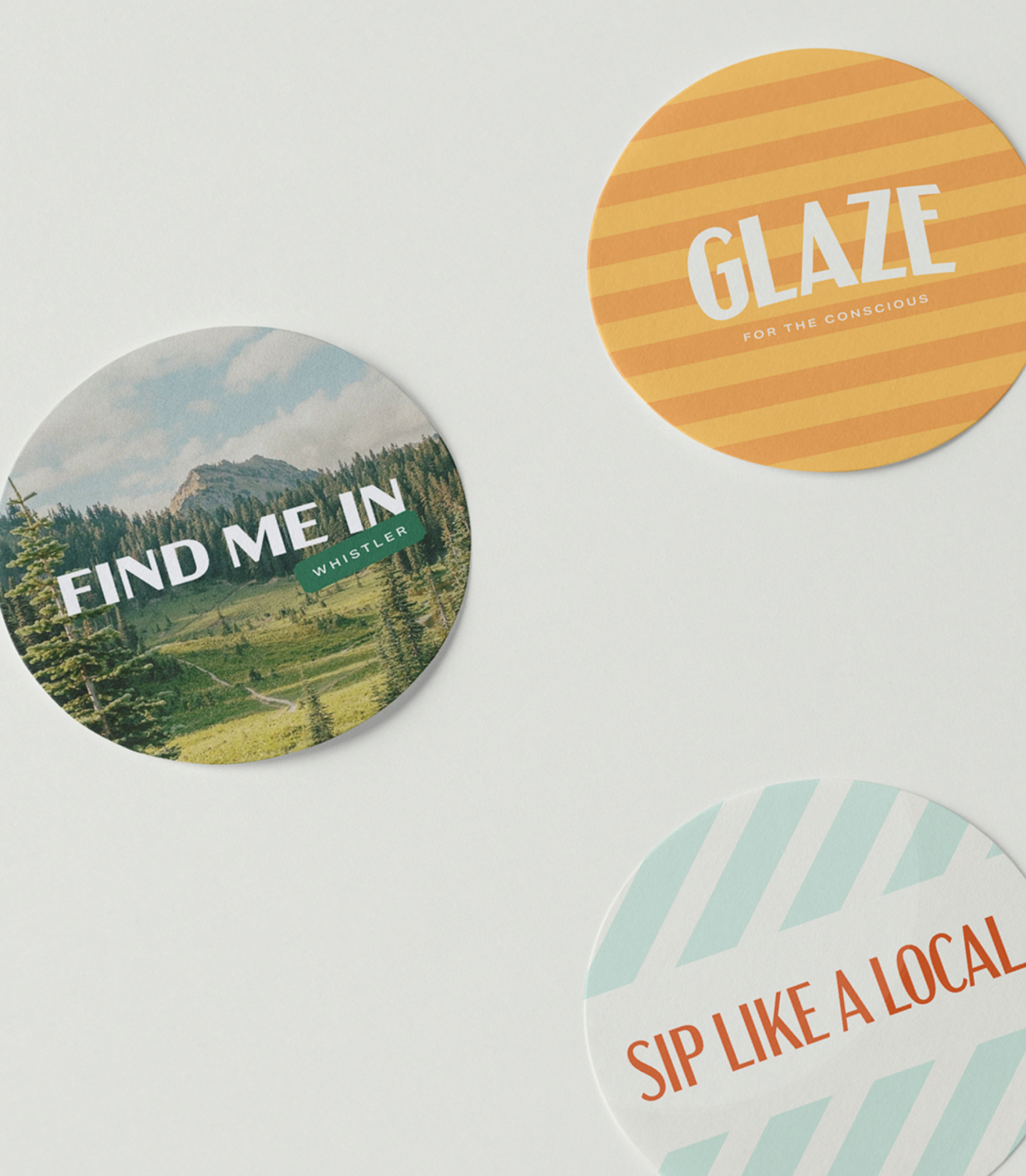
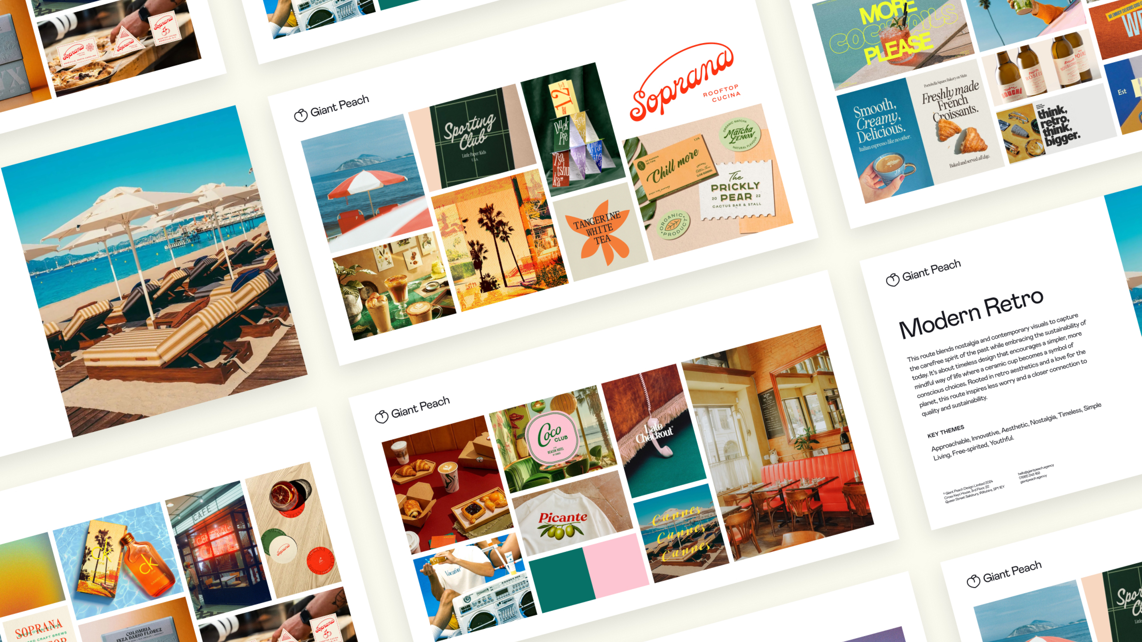
The chosen creative direction was ‘Modern Retro’, a concept that blends warm nostalgia with a clean, contemporary vibe. This approach captures the carefree, optimistic feeling of a simpler time while still feeling fresh and relevant. It imagines the future through the lens of the past, speaking to a more mindful and intentional way of living. Travel journal-inspired layouts, layered textures, stamps, and map details create a rich, scrapbook feel that tells the story of both the journey and the craftsmanship behind each cup.
Rebranding the ritual, a toolkit for storytelling
Visual Identity
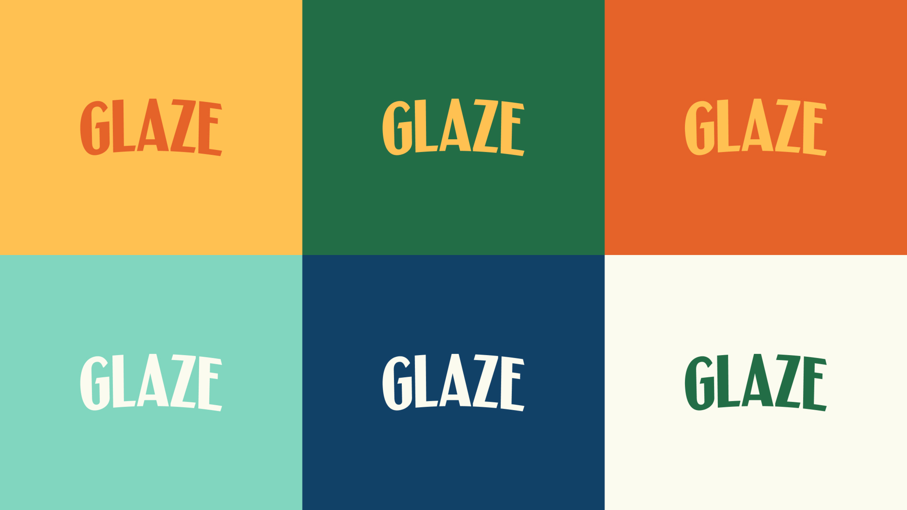
The visual identity is where the modern-retro concept truly comes to life, giving Glaze a distinct and ownable look. The new logo system is built around a curved lockup, with the gentle arc giving it a subtle, travel-influenced feel reminiscent of vintage posters and luggage tags. This system is designed for flexibility, with a primary logo, a clean wordmark, and a standalone ‘G’ monogram for use across all brand touchpoints.
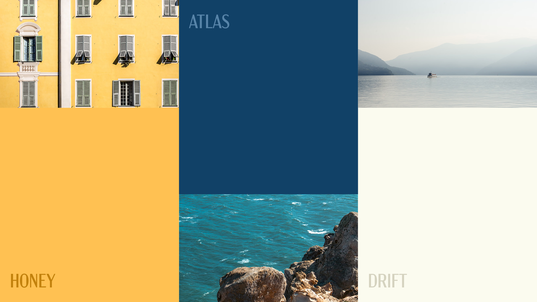
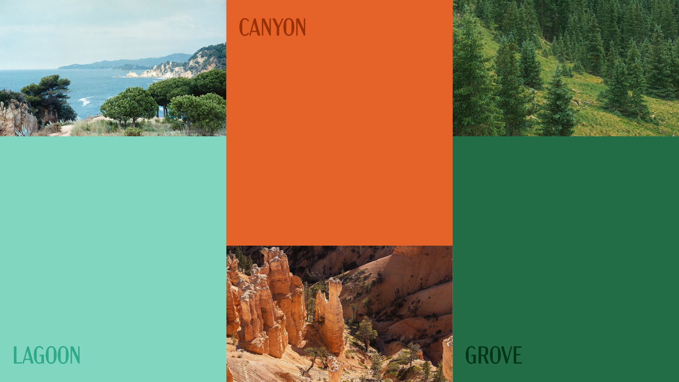
The colour palette is a journey in itself, drawing from the warm, earthy tones of sun-drenched landscapes to the cool blues of open skies, creating a sense of escapism that is adventurous and inclusive. This is complemented by a versatile typography system: Acme, a display font full of character; Aktiv Grotesk, a clean and modern sans-serif for body copy; and Alkaline, a handwritten accent that adds a human, personal feel.
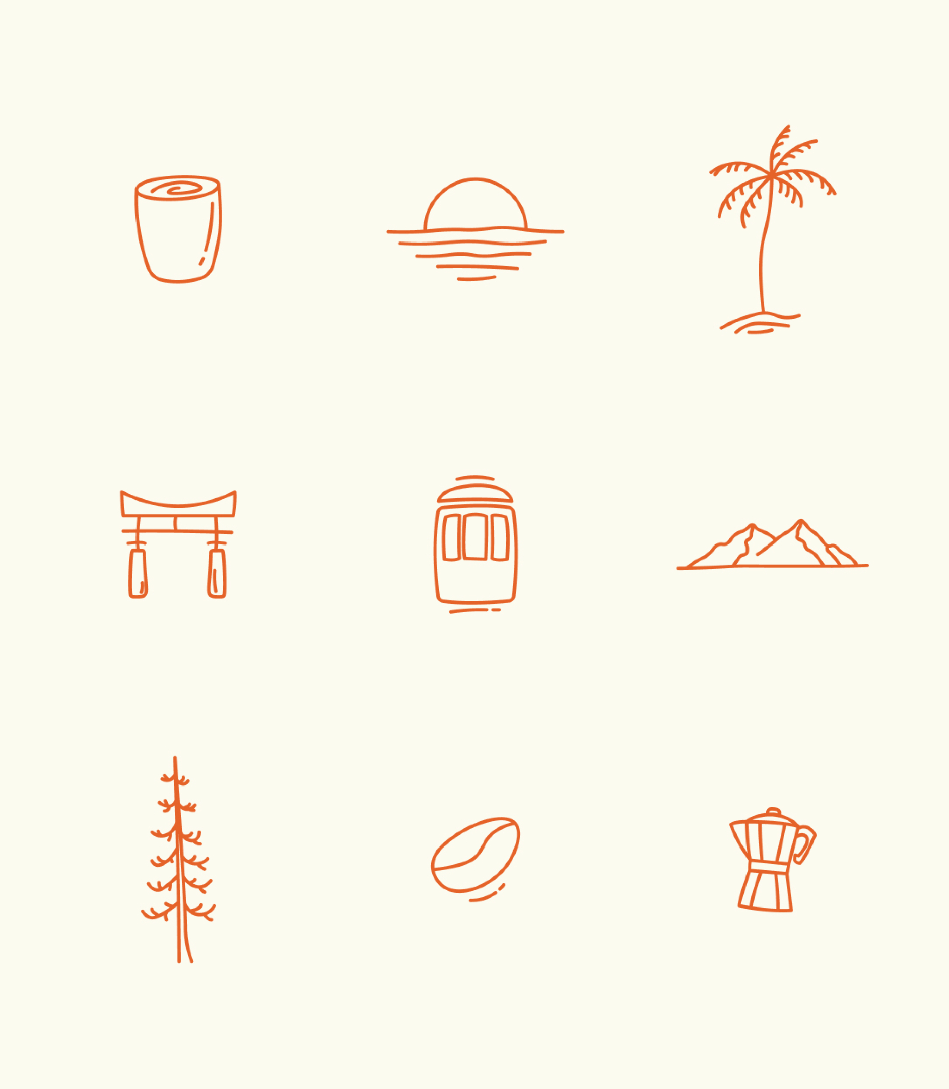
To build a layered and nostalgic world, we developed a system of patterns and shapes inspired by travel mementos like luggage labels, ticket stubs, and postage stamps. A custom suite of icons was also created, with unique designs for each Glaze cup and its associated location, alongside a general set of travel-themed icons. Our imagery direction completes the story, prioritising emotion and wanderlust with warm, film-like photography that feels both intimate and aspirational.

Discovery, direction, and design
Our process began with a deep dive into the Glaze vision. The kickoff and discovery phase was all about understanding the core ambition: to build a brand with personality, depth, and emotion. We established key themes; aspirational, layered, adventurous, and warm, that would guide every decision, ensuring the final identity was not just about coffee cups, but about moments, rituals, and travel memories.
From this foundation, we explored three distinct creative routes. The first was an organic, earthy concept focused on the ritual of coffee as a moment of calm. The second explored a literal travel-journal aesthetic with scrapbook textures. However, it was the third route, a more nomadic, retro-art-deco direction inspired by vintage national park posters and travel typography that resonated most strongly. It had an outdoorsy, liberating vibe that perfectly captured the joy of slowing down and reconnecting with the world.
From exploration to execution, and cup to companion
Summary
With a clear direction established, we honed the ‘Modern Retro’ concept into a robust and cohesive brand system. We developed the final logo, established the typographic hierarchy, and finalised the adventurous colour palette. Every element, from the custom icons to the travel-inspired patterns, was meticulously designed to work together, creating a rich and immersive brand world that positions Glaze as the ultimate companion for any journey.
