Farmer’s Yarn: Brand Identity
rethread the rules
The Farmers Yarn is a one-day outdoor wool festival bringing together over 20 stallholders to celebrate the versatility of British wool and its many amazing qualities. You’ll find everything from luxury knitwear to felting lessons, along with rare breed raw fleece available for hand spinning, sheep shearing demonstrations and some rare and native breed sheep for you to meet.
Services
- Brand & Identity
Industries
- Environment
- Farming & Agriculture
Goal
The Farmers Yarn crew approached us when looking to spruce up their branding to help their one-day festive stand out from the usual flock. Not only were they looking for branding from the festival, but they also wanted something that could also be used later down the line as an accreditation for the provenance of wool.

Define
We began by immersing ourselves in a comprehensive brand workshop, delving into the intricacies of the business, understanding the target audience, and clarifying the objectives for the event. Armed with these valuable insights, we embarked on the creative journey for the brand identity, conceptualising designs with a contemporary aesthetic while also proudly representing the agricultural roots of the people behind the event.
Direction
Our designers crafted three concepts including ‘Handcrafted Industrial’ with brutalist design influences, ‘Shaping The Process’ focusing on symbols and ‘Mono-Mark & Personal’ featuring a more organic vibe. In collaboration with the Framers Yarn crew, we combined all three concepts integrating the modernness of concept one’s type and symbols, and the roughness of concept three’s organic vibe.
Visual Impact
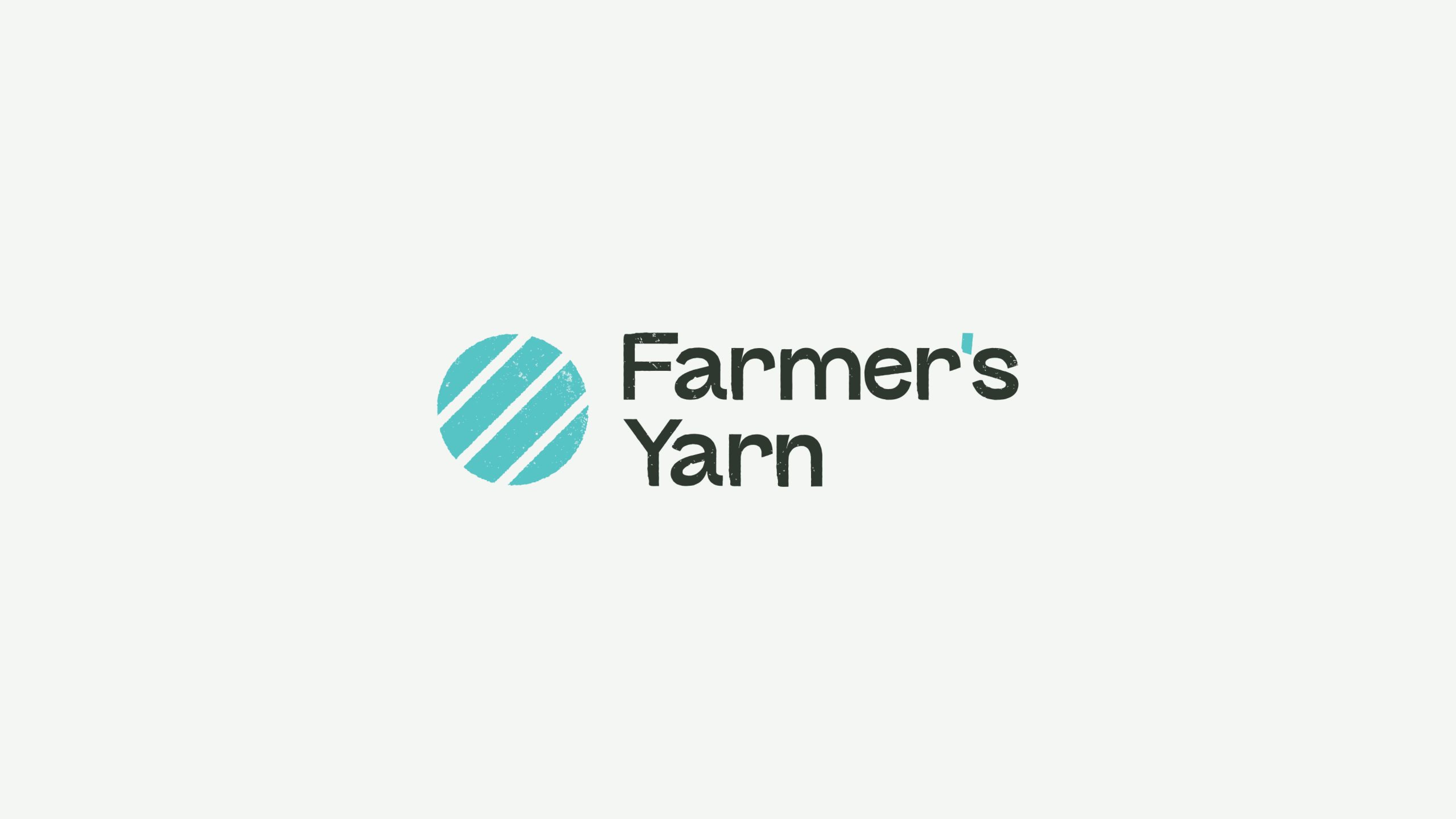
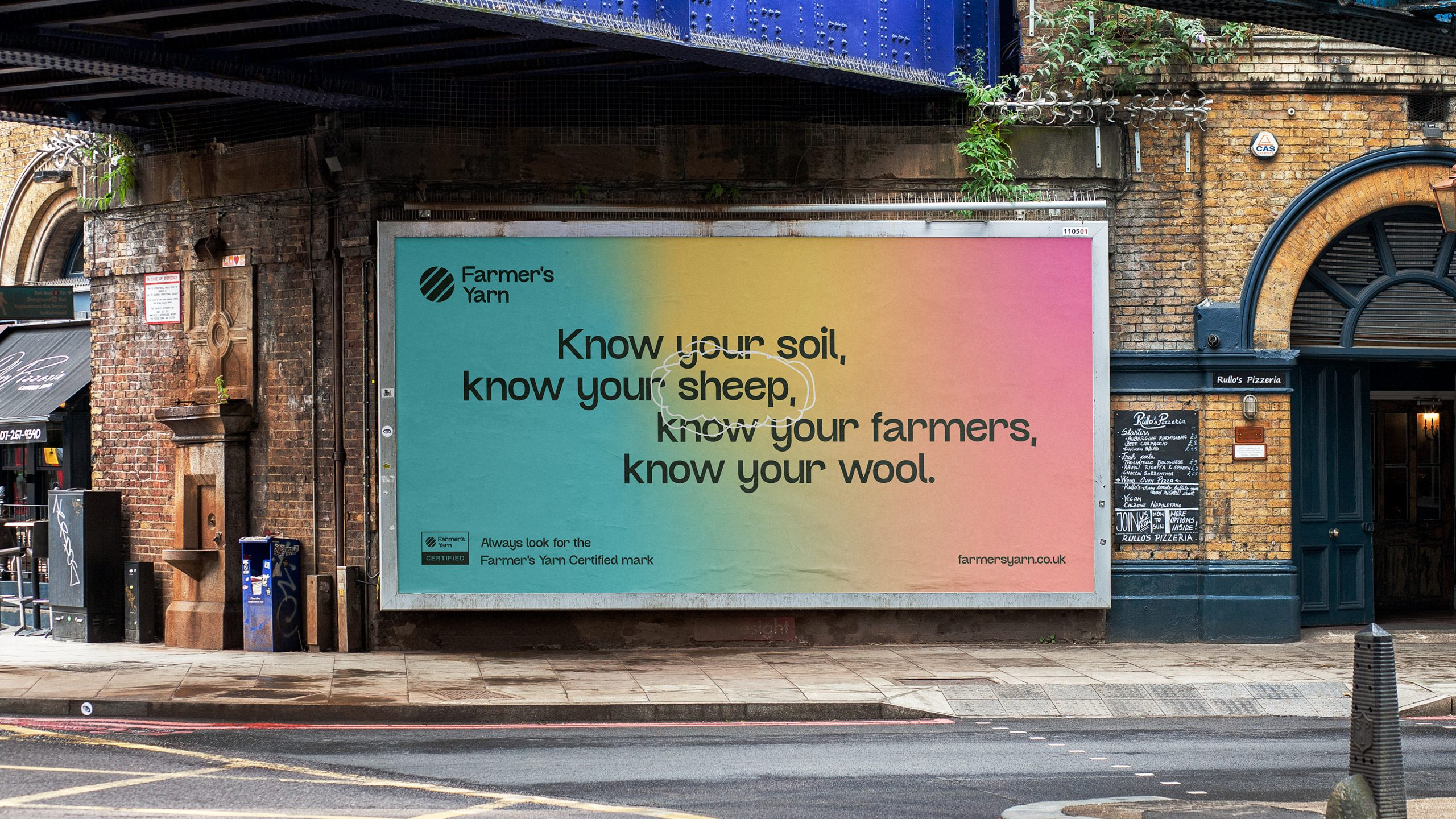
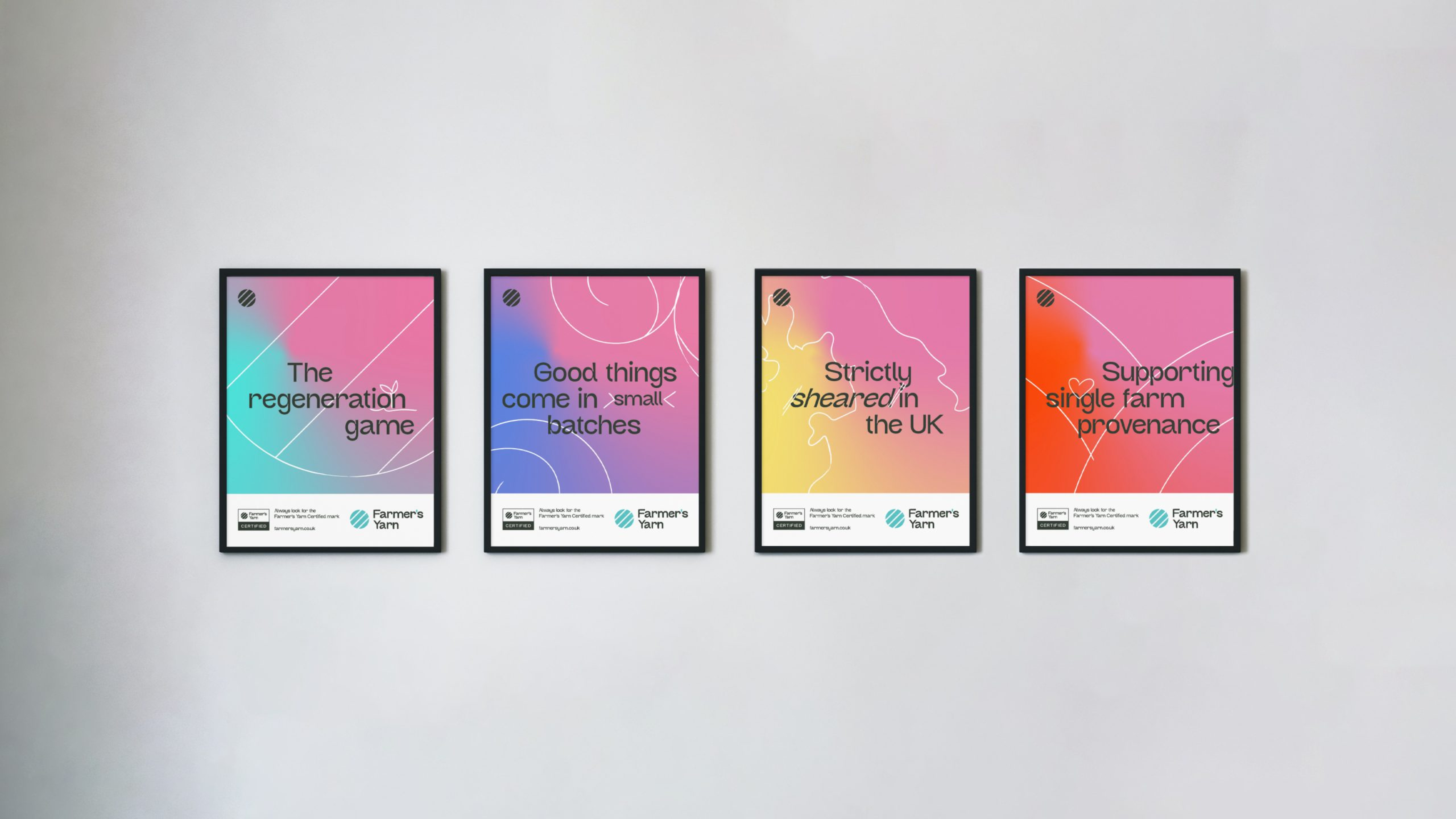
In the ultimate design, we blended distressed textures into both the brand mark and the word mark. The modern gradient palettes strike a perfect harmony, offering a blend of cleanliness and organic vibes, inspired by the adage: “pink sky at night, shepherd’s delight.”
Verbal Identity
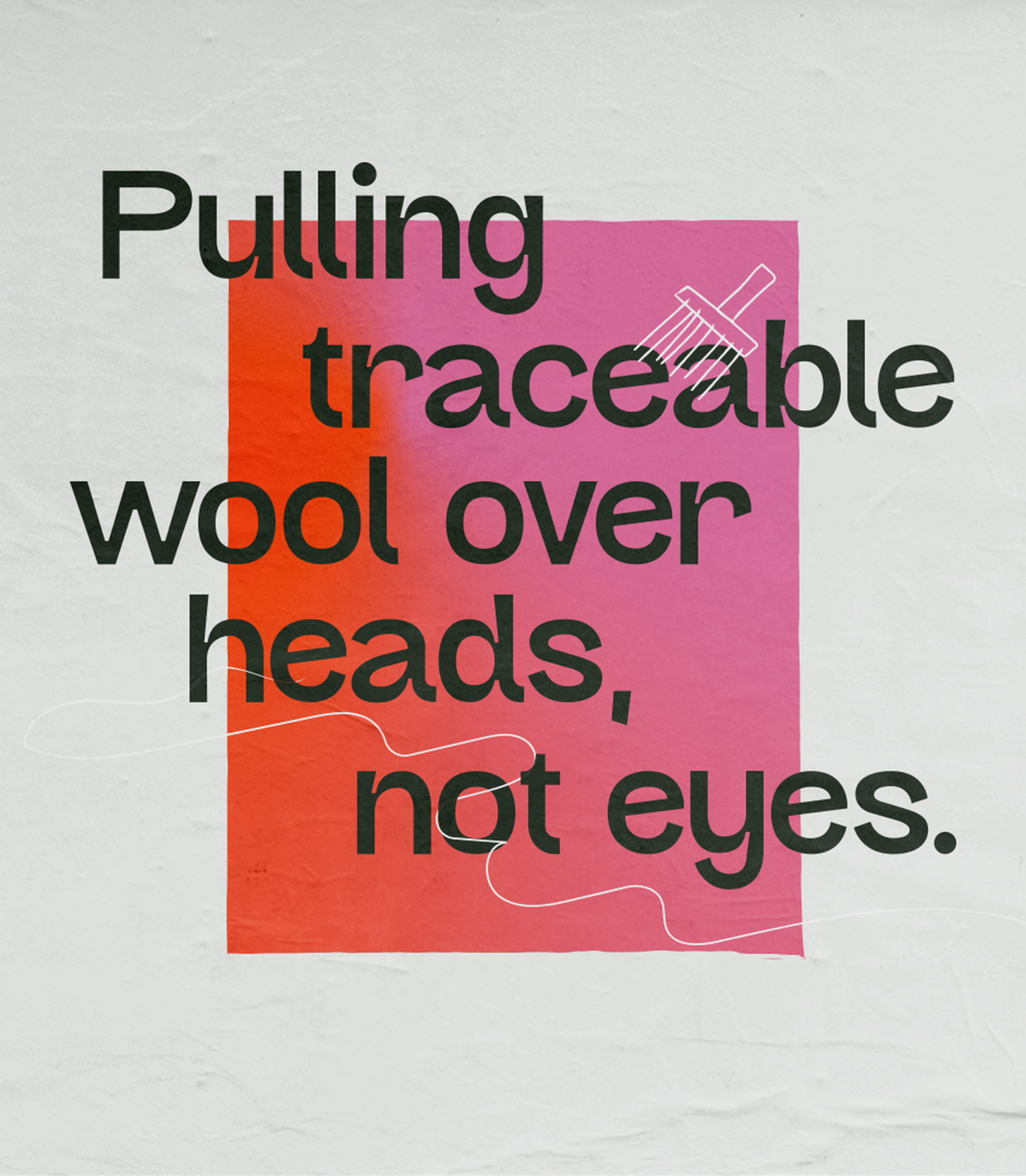
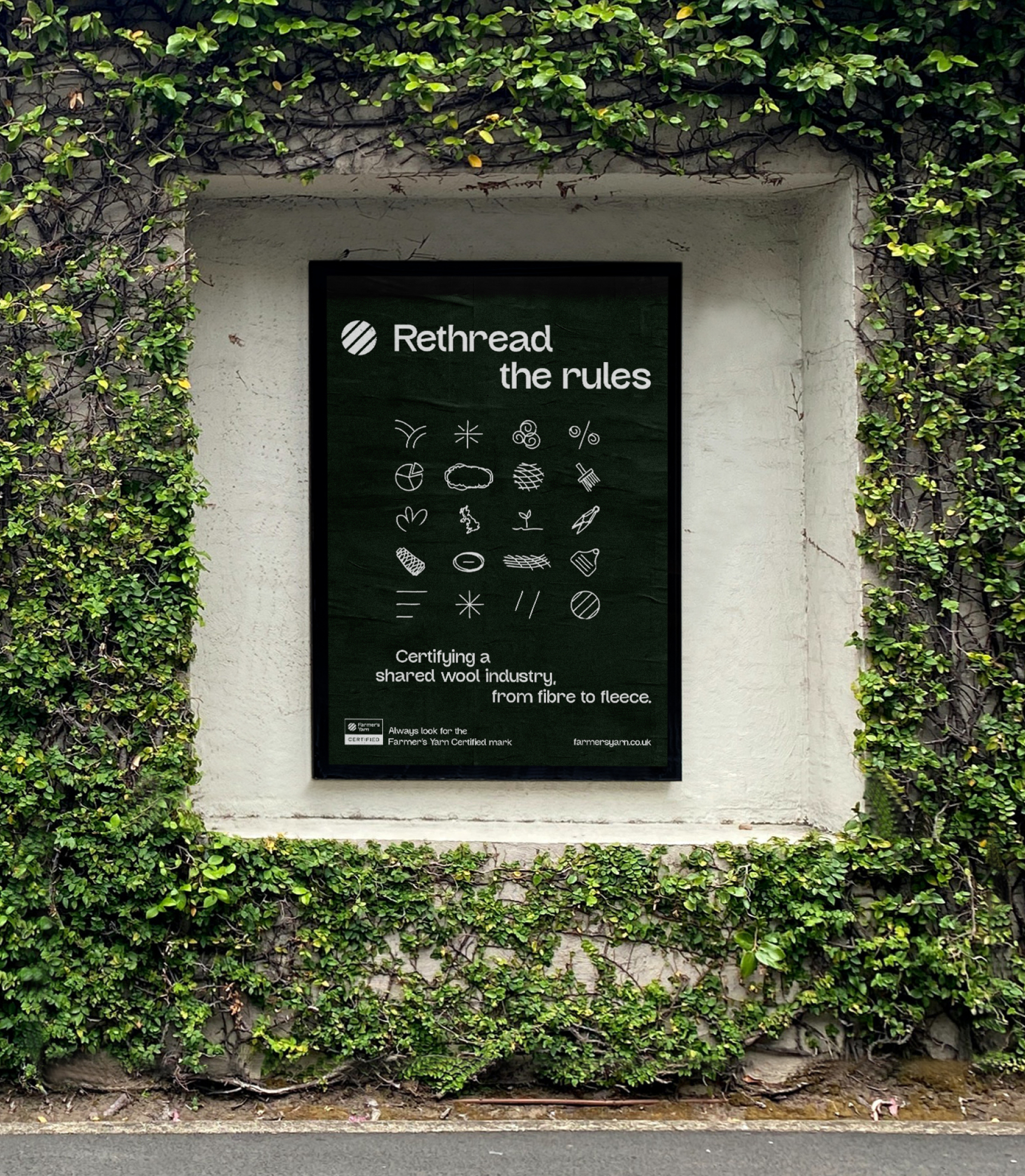
Next up, we dove into crafting key messages. They wanted the messaging to remain transparent to be true to the brand, with a sense of honesty including phrases like ‘pulling wool over your heads, not your eyes’ and also ‘Rethread The Rules’ as they wanted to spearhead positive change in the wool industry.

Results
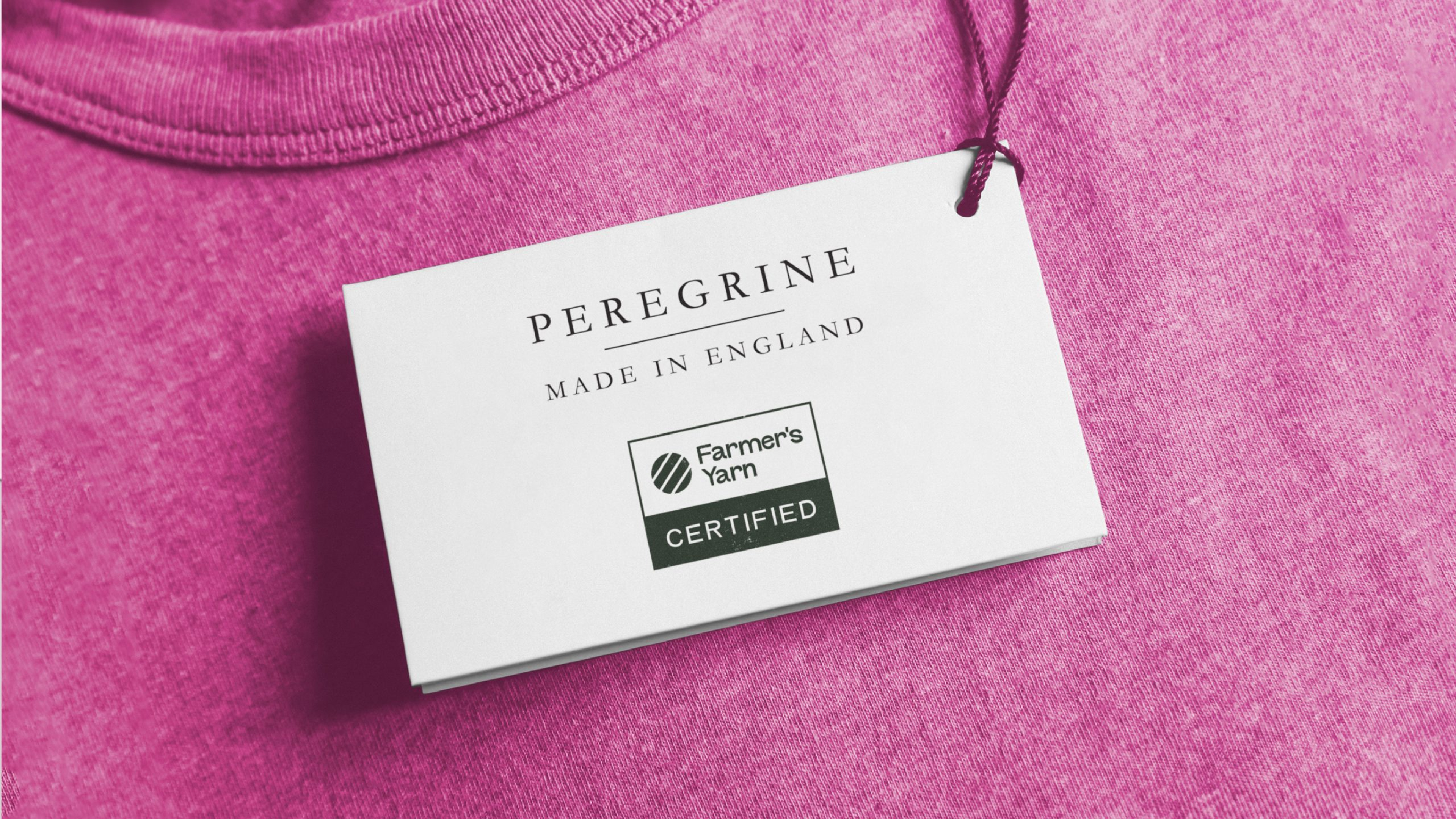
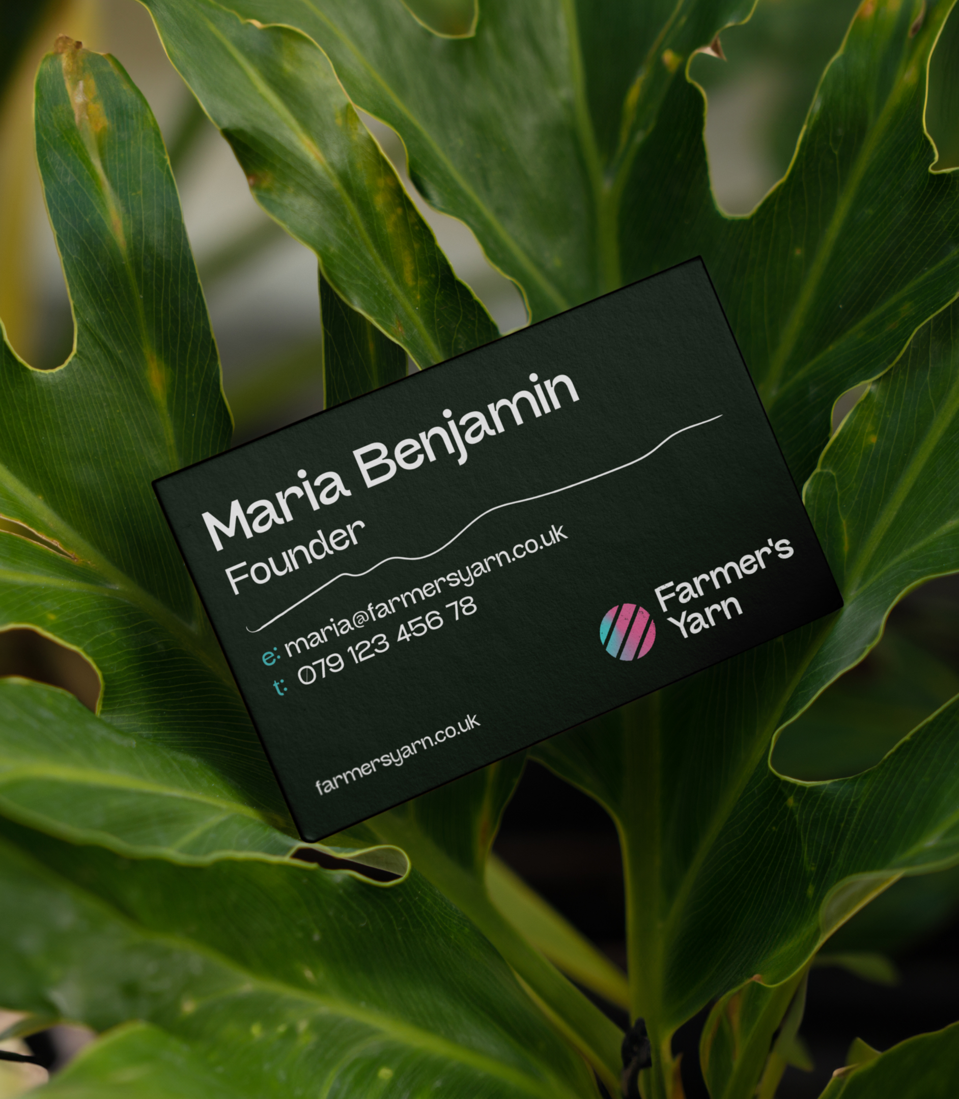
All in all, we created an overarching brand identity, a variety of accreditation logos to allow flexibility of use and a symbol set that uniquely interprets each of their practices. The ultimate design is a real attention-grabber, sparking curiosity about the meaningful values The Farmers Yarn represents. The fresh identity and key messaging will boost brand awareness, helping achieve their goal of empowering the British Wool community. We shouldn’t play favourites, but this one is up there!
