
Why Your Brand Needs A Strong Identity
Your brand identity is one of your most important assets. It’s the special mix that shapes people’s perception of your business, making it stand out in a saturated marketplace and connecting you to your target audience. Over time, your brand identity will need to evolve as your business grows. So, whether you’re just setting up your business or you’ve reached the next stage of growth, thinking strategically about how your brand identity is working for you now and where you want to be in the future is essential.
What exactly is a brand identity?
Your brand identity is made up of tangible elements that define your brand, such as:
- Logo
- Colours
- Typography
- Imagery Styles
- Tone of voice
A strong brand identity is more than just a great logo, great brands have a strong recognisable brand identity because they have a clear idea of who they are and what value they offer to their customers. This is a strategic process that requires a thorough understanding of both your business, your values, your persona and of course of your audience.
Brands doing it well
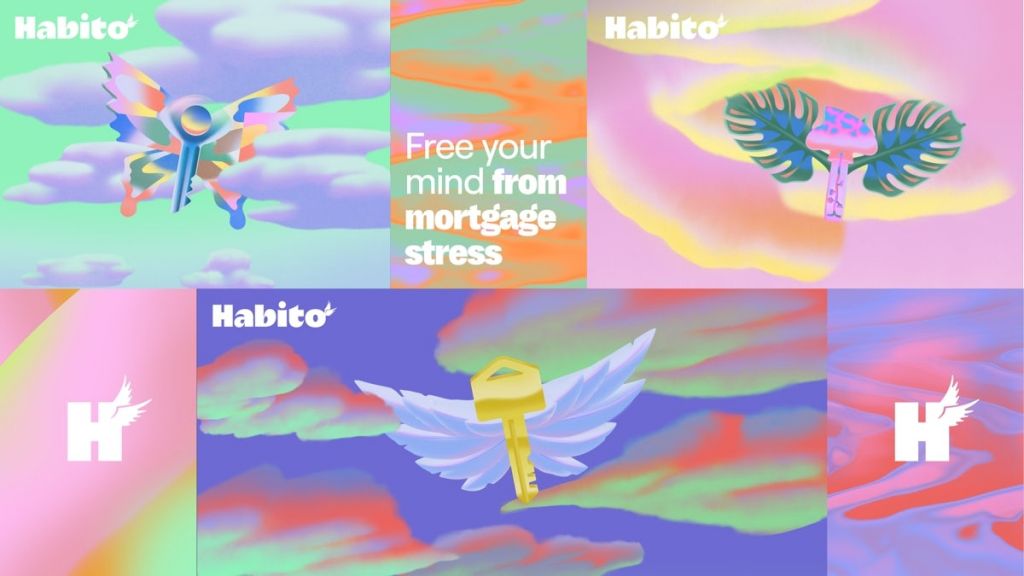
Habito
Habito is a mortgage advice company and lender that take the stress out of buying a home by giving people the tools, knowledge and support they need. The company was established in 2016 and has quickly grown. They’re now the top-rated mortgage company on TrustPilot and have achieved B Corp certified status.
To reflect their different approach to mortgages and finance, in 2020 the company underwent a complete rebrand. Because the process of finding a mortgage can often be a hellish nightmare, Habito wanted to present it as a joyful and rewarding experience. To do this, they adopted a ‘phantasmagoric’ aesthetic; a style that is dreamlike, euphoric and serene. It features a muted colour palette of pinks, blues and purple alongside beautiful imagery of butterflies and clouds. The gentle, moving imagery on their website resembles a dreamlike, heavenly experience – a stark contrast to what you expect from a financial services company! The use of modernist fonts and a clear tone of voice make the user experience pleasurable – the lack of jargon in particular creates a sense of ease.
The new brand identity has been applied across Habito’s website, social media and other marketing material and the result is fabulous.
Lego
The world-famous toy company needed to evolve its branding while the business was growing globally and expanding into new markets. After years of loss-making, in 2004 the brand started to change its marketing approach. They developed new products and launched collaborations with movie franchises like Star Wars and Harry Potter, which opened the brand to new audiences of all ages.
Lego needed to evolve their branding so that it would work both globally and across different age groups. Recognising the competition for children’s attention in the digital world, Lego’s new brand identity required a strong online presence too – including a YouTube channel, online video games and social media. As well as introducing all these new additions to the brand’s repertoire, they also made slight changes to their iconic logo which had remained the same since 1998, like squeezing the LEGO letters together and making the whole emblem a bit narrower.
The revised logo and brand identity was sharper and transferred better to different online platforms, while still retaining all the things that conveyed the much loved history of the brand. Since updating their brand identity, the company’s sales have rocketed.

Oatly
Swedish brand Oatly has been in the business of making oat milk for twenty years but has grown enormously in the last five. Sales have risen from just under $1m in 2016 to $400m in 2020, and are forecast to hit $800m this year. While most of this growth is down to the popularity of plant-based diets and extremely clever marketing, the pandemic caused sales to accele
rate due to people stockpiling their longlife milks.

Around 2012, Oatly changed up every aspect of their brand identity, adopting a chatty and irreverent tone of voice across everything from their packaging to their website copy. Their brand identity brought personality and humour to an industry that at the time was a little stale, while their hand-drawn typography and flat colour schemes enhanced their persona and became instantly recognisable.
Oatly made their ethical values very clear from the start, calling out the role of the dairy industry in greenhouse emissions. Customers with similar values could connect to that very easily. And their product is excellent too, with coffee shops all over Europe using the ‘Barista Edition’ milk to achieve the perfect froth.
But it’s not all smooth sailing. Oatly faced backlash from activists last year after selling shares to a consortium that included Blackstone – a private equity firm headed by a Trump donor. The same firm is also connected to the deforestation of the Brazilian Amazon. While Oatly has explained why they accepted the offer, some previously loyal customers have lost trust in the brand.
Your brand identity shouldn’t be an afterthought, it should fill you with pride and connection with the brand you are building. But don’t worry if you’re not quite on top of it, that’s what we are here for. Join me for a workshops on The Importance Of Brand Identity where myself and James will help you decipher the direction your branding should take, helping you figure out what works best for your business right now and for where you want to be in the future.
Joey Hoskins, Creative Director, Giant Peach
More Updates Delivered!
"*" indicates required fields