Ethical Healthcare Brands Killing the Plastic Reduction Game
Unless you’ve been living under a rock, you’ll know that you should be reducing your use of plastic – and even more crucially, single use plastic.
(Humble brag warning.) We’re really proud to be a B Corporation certified company, which not only means that we meet the highest standards of social and environmental impact, but that we’re always striving to always do better as a company, and as individuals. (Humble brag over. Phew.)
So to spread the word, we’re celebrating four inspirational companies we’re making good use of. They are making the job of reducing the amount of toxins from plastic that end up in our bodies, soil and waterways, easy.
But we’re a creative agency, so we’re not just going to wax lyrical about how these products have stopped us sweating or saved us some cash – we’re going to take a good look at why their visual identity, brand message or website is on point too.
Wild
Wild “want to shake-up the throwaway culture of bathroom products with high-performing products made from natural ingredients that never compromise on convenience or efficacy.”
Client Relationship Director, Dawn, recently made the switch to Wild’s deodorant and is not looking back. Developer Harry is a big fan, too. Offering effective sweat control in a range of delicious scents, Wild’s deodorant – their hero product – uses all natural ingredients and comes with a reusable aluminium applicator. Refills packaged in sustainable bamboo pulp can be bought from the site on a single or monthly subscription basis – or on the high street.
Wild also offer refillable aluminium shower gel bottles (the refills arrive in zero plastic bottles), soap and shampoo bars.
And every time you make a purchase, you’re helping to plant the Wild forest through the brand’s partnership with ONAMISSION. Win-win.
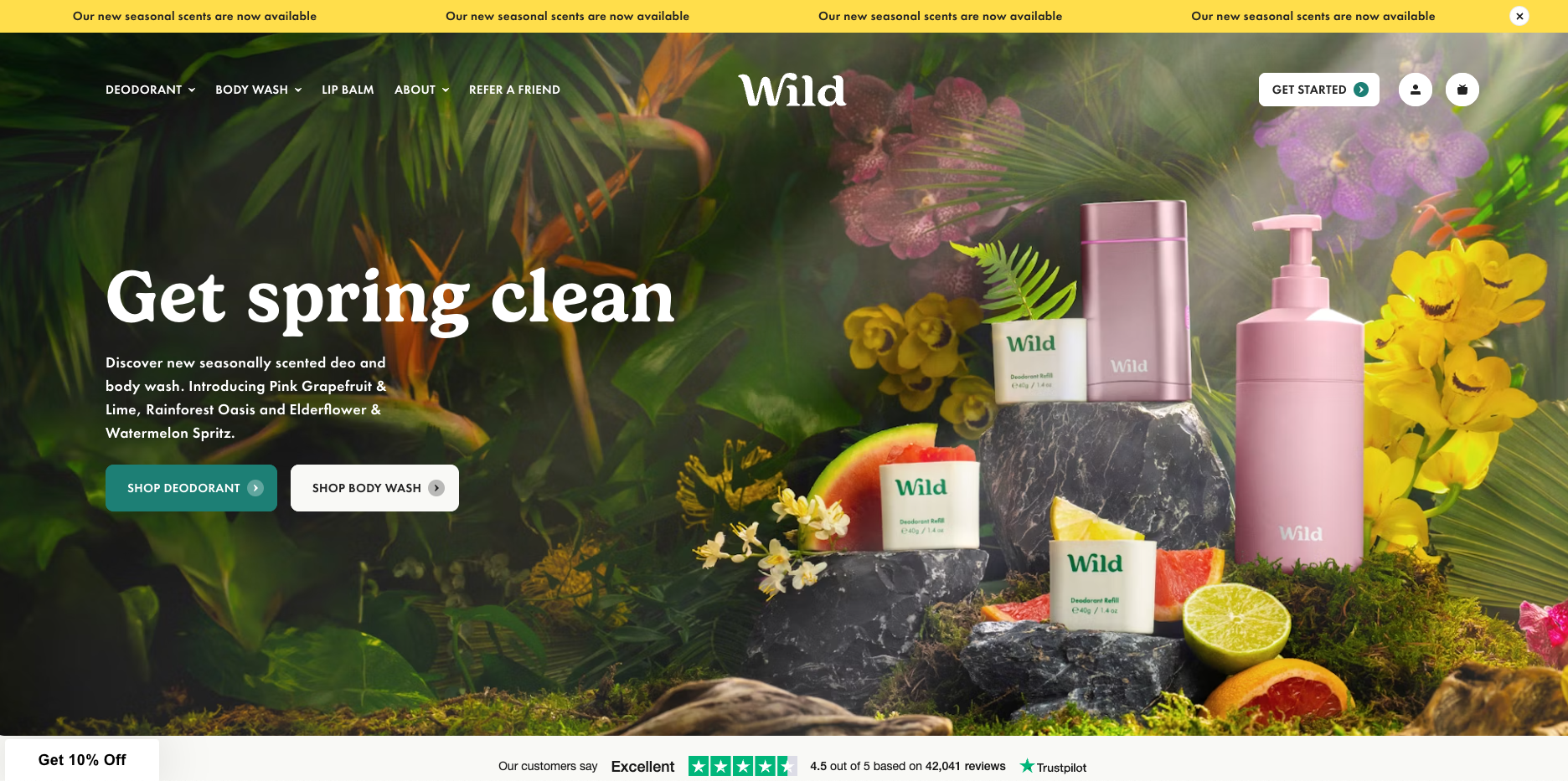
Our designer Josh, had this to say about their website’s design and UX :
Wild’s homepage makes great use of immediate calls to action, with clear split signposts for their two most popular products, deodorant and shower gel. Burger menu and basket icons are also easily discoverable and they’ve cleverly positioned Trustpilot reviews just beneath the banner. Of course, reviews for any product are important – but with personal care it matters even more!
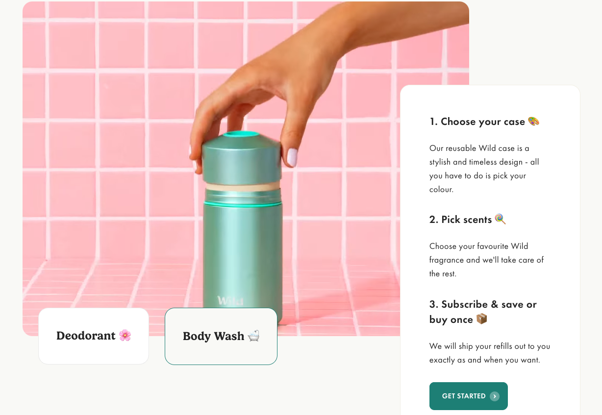
I particularly like the “How it Works” section – again, split into the two hero products – with awesome in-frame close up videos showing how ergonomically satisfying using the products appears to be.
Dedicating an entire page to ingredients to really emphasise the transparency they promise is a smart and bold move versus keeping them buried in the product page. Although it is quite basic in terms of the design itself, it goes into great detail on why each ingredient is used specific to that product type.
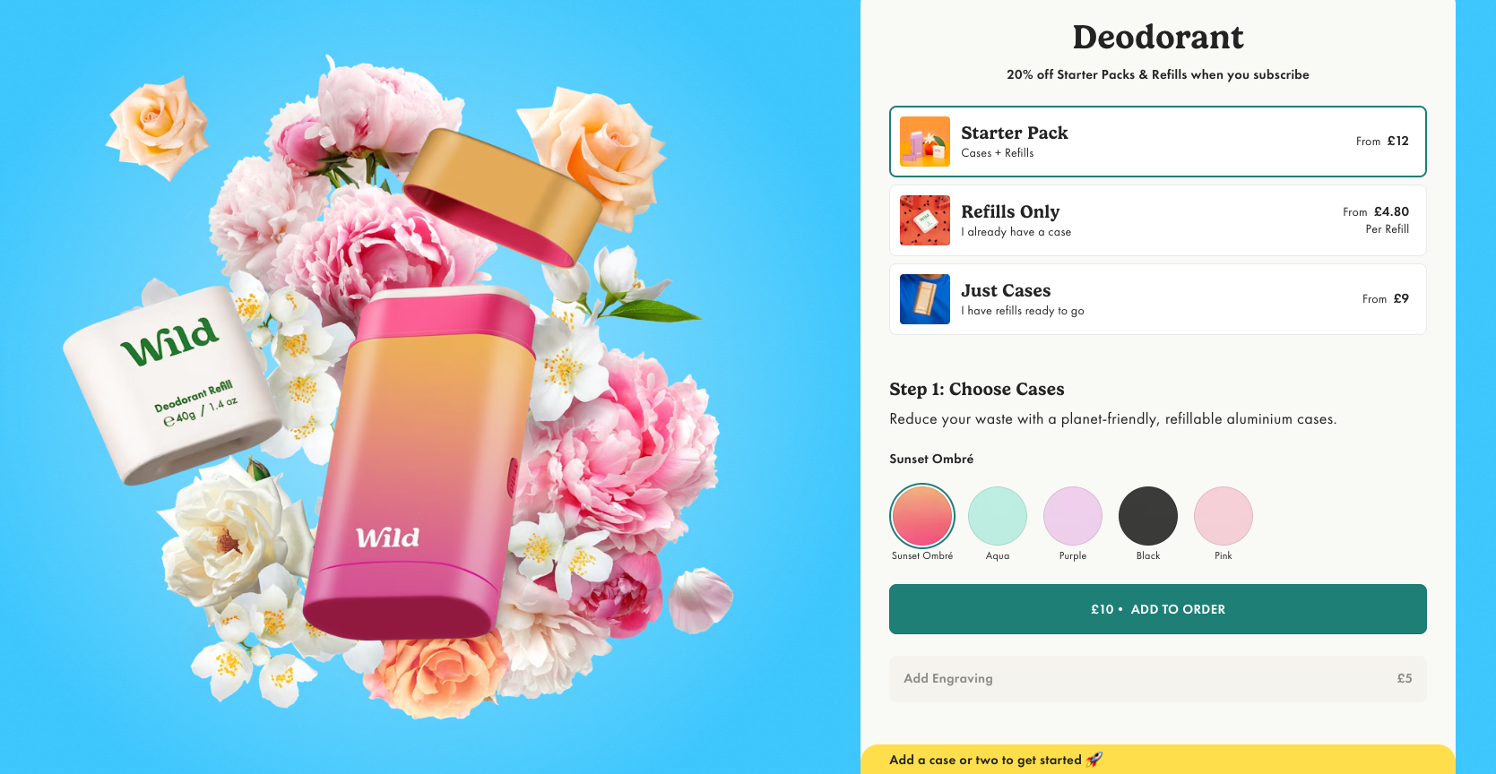
I was most impressed by the purchasing journey. After clicking “Get Started,” the user is taken immediately to a stripped back version of the site. Perfect for capturing that visitor who knows exactly what they are there to do and wants the experience to be as simple and seamless as possible. Burger menu, basket icons and top value prop/promo bar have been removed to reduce distraction, with a consultation-style list of steps and clear labelling to indicate which one you’re at. I can choose a different step to scroll to within the sticky nav, and whilst further steps are ghosted out until you’ve completed the previous one, it’s nice to have a quick scroll to see what’s ahead! They’ve carried through the site styling well to make it fun and exciting – but if all the excitement gets too much, I can also exit the consultation/purchase journey easily.
Overall, a very pleasant site to use, plenty of white space and digestible information, and a smooth, uncomplicated User Experience with clear signposting and a streamlined product purchase journey.
Constructive criticism might be that there are quite a few carousels on the homepage showing products – perhaps a little bit overkill? It’s good for brands like this to strike a good balance between a shop and a brand site; plugging the story of the product almost as much as the product. Now that Wild are being stocked in ever more places, perhaps they could rethink the carousels – they’d be fair enough to leave them in if the website was the only place they could be purchased from!
Who Gives a Crap
Who Gives a Crap have long been established as a market leader in sustainable loo roll – but Giant Peach Front End developer Harry, has recently made the switch to their premium bamboo product after upgrading from their standard recycled loo roll. Swish!
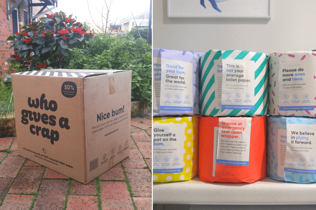
Harry says… “We’d 100% recommend this product. Bamboo grows incredibly quickly and is 100% biodegradable, making it far more sustainable than regular loo roll. Bonus points for the brand, they source their bamboo from farmers who plant it on the border of their family farms, meaning there’s no mass of land being ripped up to plant trees etc.
They also donate 50% of their profits to help build toilets and improve sanitation in countries that need it, which is cool.”
Our Account Manager and copywriting expert Jen, had this to say about the brand’s tone of voice:
Who Gives a Crap have an absolute nightmare of a subject matter at the heart of their brand’s function – or a gift from the gods, depending on which way you chose to look at it. WGAC have always had the balls to emphatically lean into the latter, not shying away from what a lot of other brands would cringe at or sweep under the carpet – and it’s working wonders in their favour.
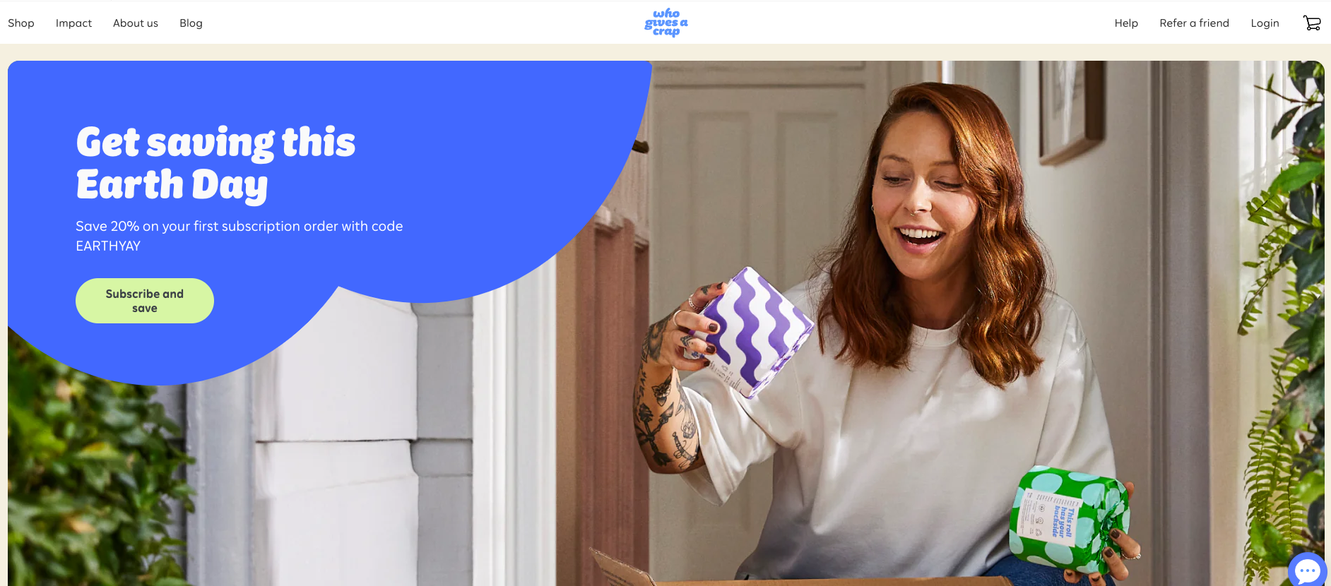
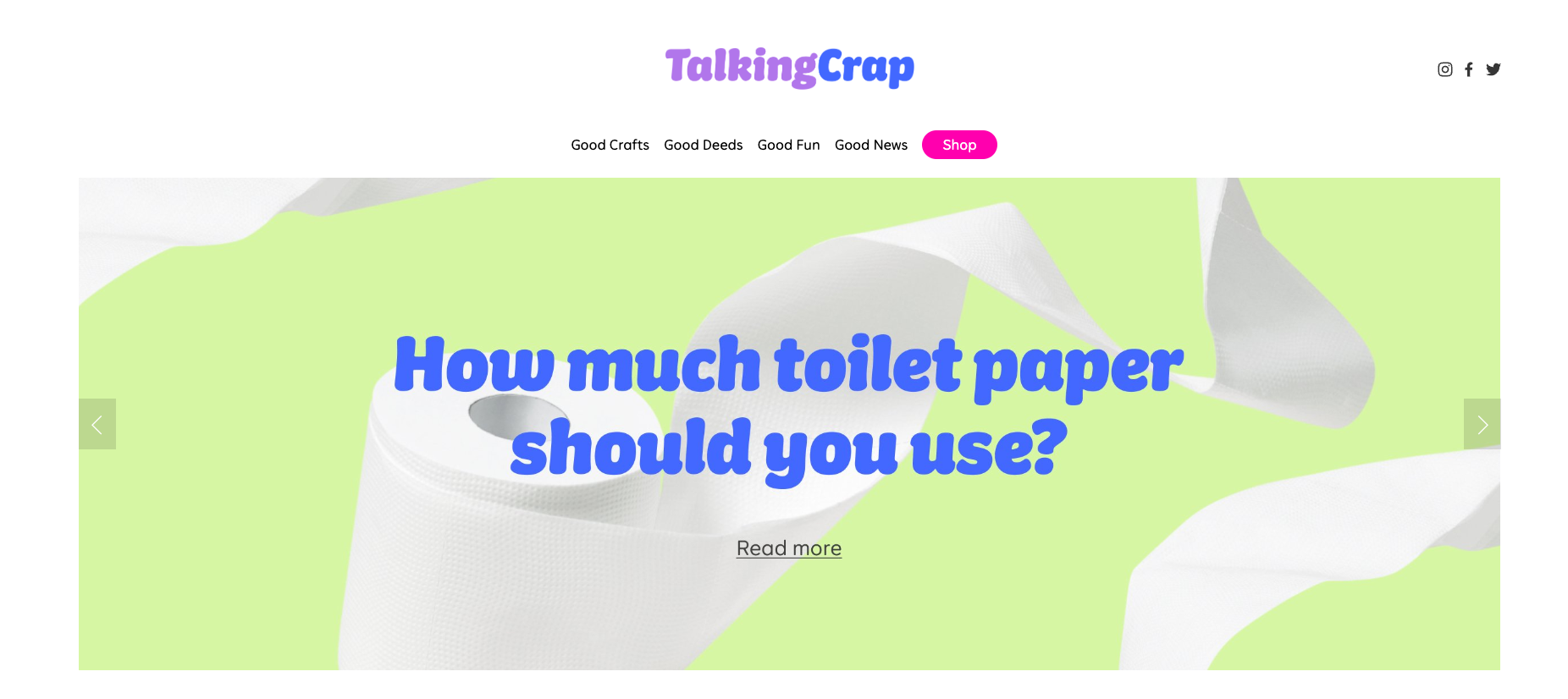
As they say themselves, toilet humour and making the world a better place are the twin pillars the company is founded on, and these two themes permeate every single place their words appear. And I mean everywhere. From the website with its weird and wonderful ideas for reusing brightly coloured roll wrappers (loo roll packaging origami, or party decorations anyone?) to the range of jokes, puzzles and “emergency use only” warning signs on the packaging of the individual rolls – it’s go hard, or go home.
And that applies to the language too. Tone of voice can be hard to get right and nail consistently, but WGAC are best in class. A humorous, playful, tongue in cheek, relaxed yet upbeat, sun-soaked-good-vibes feel radiates off the pages of their site – playing in perfect harmony with the bubble style brand font, Aussie founders’ story and bright brand colours. But – they’re clever and respectful enough to tone it down a bit when talking about important issues.
Great examples of how WGAC’s tone of voice is consistent and fully embedded in their comms:
- Their code for an Earth Day promo? “EARTHYAY”
- Box branding strapline? “Wiping Away Poverty”
- A line from their brand story? “Billions of people lack access to clean water or a toilet. It’s crappy.”
- FAQ Answers? “We use recycled office paper, not used toilet paper, to make our TP. Get your head out of the sewer!”
- LinkedIn Job Posting? “As our Influencer Manager, you’ll lead our strategy for influencers and content creators that brings new bums to the fold.”
A lot of brands think they talk directly to their audience and want to establish a personal relationship with their consumers – but I’ve never seen anyone do it as effectively as Who Gives a Crap. Just as TV dramas sometimes break the fourth wall with a character talking directly into the camera lens, WGAC’s language addresses the reader informally, as a friend, often including positive affirmations and relaxed messaging to help you feel like one of the gang saving the world. I’m sold.
FFS Razors
Our fearless leader James, has recently started using FFS (Fuss-Free Shaving)’s razors to help him with all his manscaping needs.
Another subscription brand (there’s definitely a theme developing here…), their razor handles are made from metal and come complete with a lifetime guarantee. They also run a recycling programme for blades.
Creative Director Joey had these thoughts on FFS’s brand identity and key messages:
Fuss-Free Shaving have done a great job with their now iconic razor. First things first, the product has helped build the brand – Rose, the rose-gold tone metal razor handle for women is instantly recognisable, designed for a specific problem and comes with a life-time warranty. Sustainability and eco-friendliness being core to their values is something we’re on board with, so with them partnering with Carma and offering their own recycle scheme, what’s not to love?

The tongue in cheek trick of juxtaposing a common acronym for exasperation and frustration against an elegant typeface and product that looks good in anyone’s bathroom, makes them stand out against other brands, providing an instant, in-your-face point of difference that cements them in the consciousness of their target audience .
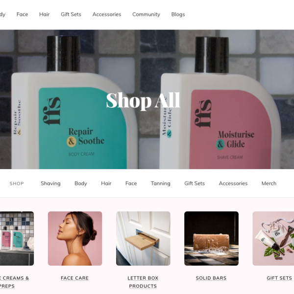
Since their inception, they’ve extended the product range beyond razors. They’ve kept the elegant and bold typeface but are now juxtaposing this against some bold colour choices and patterns to categorise their product architecture – which centres around skincare.
The brand’s evolution can be seen on social as well, shifting from product posts to self-care routines that engage on more of an emotional level. And it’s social that the brand really comes into its own of course, whilst the website did leave me feeling a little underwhelmed.
It’ll be interesting to see which direction they go in next, now that the original hero product is being used by more men.
Suri Toothbrushes
Suri toothbrushes have been invading Instagram algorithms with a series of influencer partnerships that hit the mark – including Gen Z/millenial favourite, @emthenutritionist.
The self-dubbed “last electric toothbrush you’ll ever need” – a Suri is truly a thing of beauty, with the eco credentials to match. Every year over 4 billion toothbrushes end up in landfill or in our oceans – enough to circle the globe twelve times. Suri are promising “a better clean in every way” with a repairable brush made from aluminium and recyclable heads made from bio-based products.
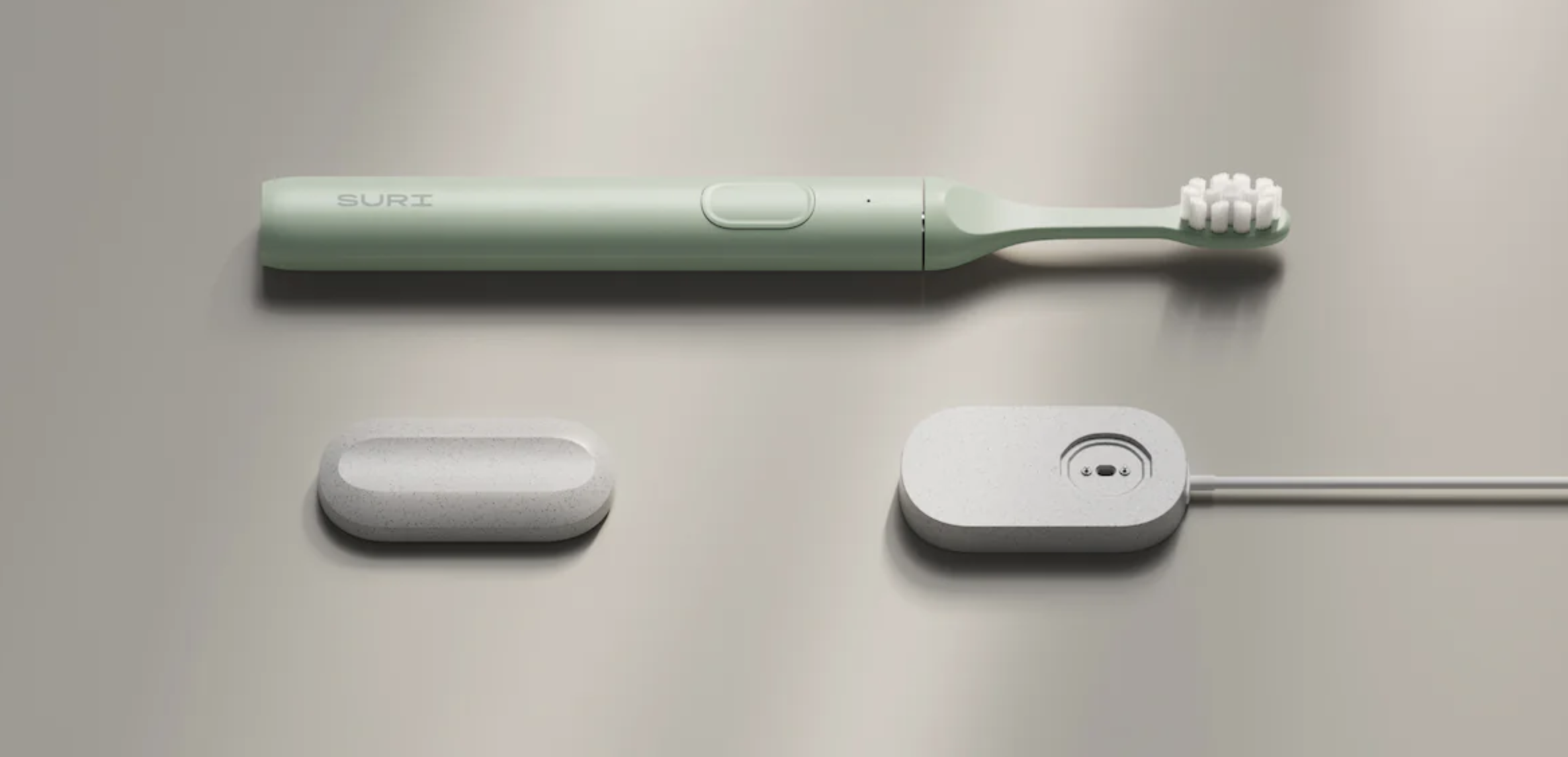
Maddy, Giant Peach Designer, has fallen for her Suri hook, line and sinker: “I am so impressed by this brand – right from the purchasing journey through to the end experience it’s delivered on all fronts. I’m recommending these brushes to everyone. Well done Suri.”
Seems like our Front-End Developer and e-com specialist Harry is tempted too… Here are his thoughts on the Suri website.
The website is incredibly easy to use with a very smooth buyer journey. All items on the product page are laid out in stages, so it’s super simple to see what you’ve got to select next. If you try to click the next step before completing the one you’re, on it highlights your step – a great guided interaction providing instant feedback for the user.
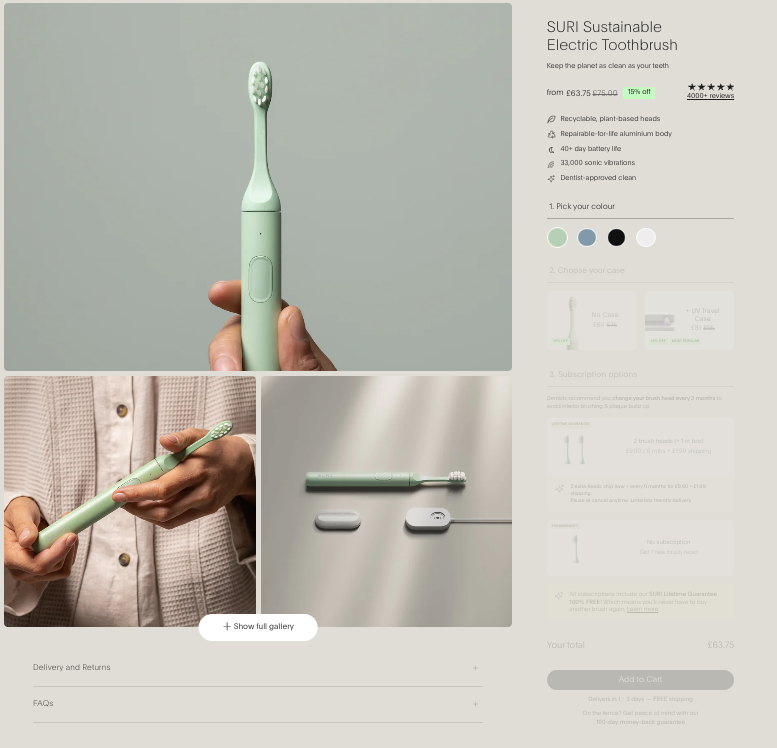
Like the brushes themselves, everything felt quite streamlined. Even finding out information about the product was easy and when discovered, well laid out with easy to manage content blocks. At no point did I feel lost or confused about where I needed to go next.
If I could make any small suggestions it would be that the initial viewport was quite overwhelming. Between the video, the scrolling banner at the top and then the big black banner which pops up at the bottom, there was a lot of information all at once.
Overall, a great brand with a really clean user experience… I’m actually very tempted to give them a try after reading through their info!
There are a lot of awesome companies out there making great products and doing the right thing by the planet, but those that break through into the mainstream have one thing in common; a solid brand identity, communicated beautifully. To find out how we can take your ethical, sustainable brand to the next level, book a call.
More Updates Delivered!
"*" indicates required fields
Read this next
Read this next


